Styling To Sell: The Playroom/Family Room And The 4 Lessons I Learned Along The Way…
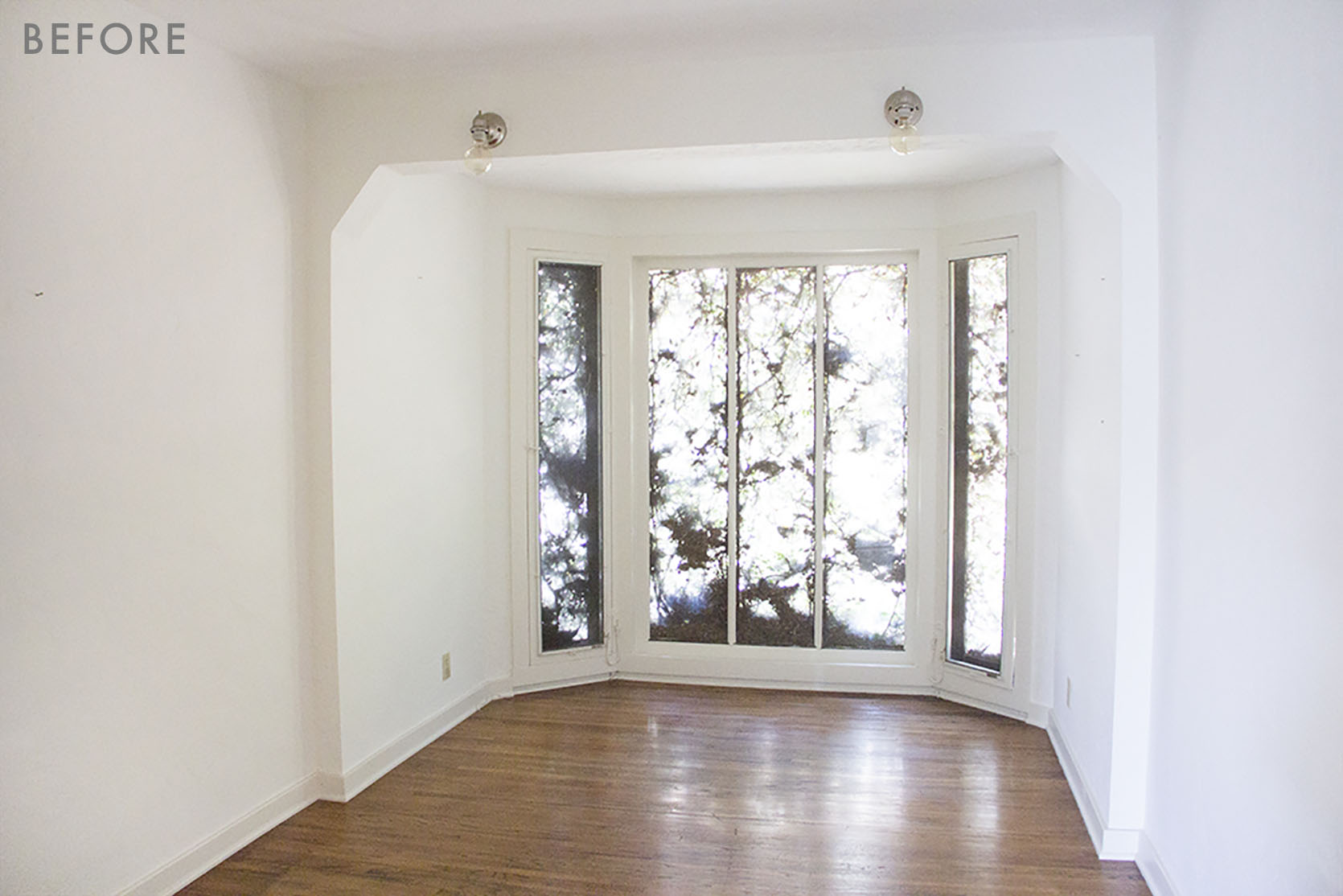
Today is full of good lessons, but listen, there is no way to learn and grow without making mistakes, and sometimes they are unavoidable ANYWAY. But first, let’s walk you back from the beginning. When we first bought the house this room was considered a bedroom, even though it didn’t have a door. When we renovated we reconfigured that area to make a better laundry room, powder bath, and decided that this room should be either a family room, TV room, or playroom (all three?).

It’s simple and cute and was covered in ivy so you couldn’t even see out, but that sweet little architecture was nice, if not awkward to design around. It’s narrow, which is harder to design, as I’ve written about here, but doable.

It’s been through a lot of iterations because its purpose kept changing.
LESSON #1 – IDEALLY YOU’D KNOW HOW YOU WANT TO USE THE ROOM BEFORE YOU MAKE MAJOR DECISIONS
At first, we wanted it to be a cozy TV room so we painted it dark blue. I had a 1 and 3-year-old and no TV room, so we thought this could kinda be 1/2 playroom, 1/2 TV room and I love a dark TV room (Sara’s is a much better example).

LESSON #2: DARK COLORS CAN BREAK UP FLOW OF AN OPEN SPACE PLAN (IF NOT DONE RIGHT)
While I love this blue (I think Stiffkey by Farrow & Ball), it was a mistake because it was too open to the rest of the house and cut off the flow making the house feel chopped up and small. Whoops.

We took a shot of it because that’s what we do, but it never really worked. Here’s where it got weird.
At one point we needed it to function as a guest room AND tv room and playroom and we had these curtains leftover so we hung them over the entrance for privacy and coziness.
LESSON #3: Don’t let desperation lead the design process
I’m pretty sure desperation should never guide any long term decisions (marriage, career, house buying) but it often does because we are human beings. That curtain created privacy and coziness (the TV was behind the curtain) but it was also TOTALLY WEIRD. Admittedly while you were inside of it, watching TV with the curtains “closed” it did feel really cozy. But from the back (the entrance) you just saw liner for a long wall.
I chalk this up to having two small kids and making weird decisions to make my life easier. This was before we got the projector screen in the living room and a TV in our bedroom, solving both of our problems. We wanted a cozy place to watch TV when really what we needed was a playroom for our then 2 and 4-year-old. It’s open to the kitchen and is the perfect place for then to play. Meanwhile, the living room became our big TV room (projector not annoying at all), and adding the TV into our bedroom satisfied my “cozy nights without Brian” problem (he was gone a lot at nights doing rehearsals and performances). So after about 2 months or so of this weird “curtain theater room” we put in the projector, gave that sofa to this feel good flash makeover (the rug is now in the basement), gave my best friend the curtains and I started over.
Once this didn’t need to be “The TV Room” I was able to focus it on what we really needed with two small kids, like I said, a playroom.
So I started transforming it slowly… Stage One.

Stage one we kept the window curtains, rug, and added all the storage. As any parent knows when kids are super young (toddler age) they need space and cubbies (not closed storage because they strangely forget that they’re there). So this didn’t look AWESOME but sure, they played in it.
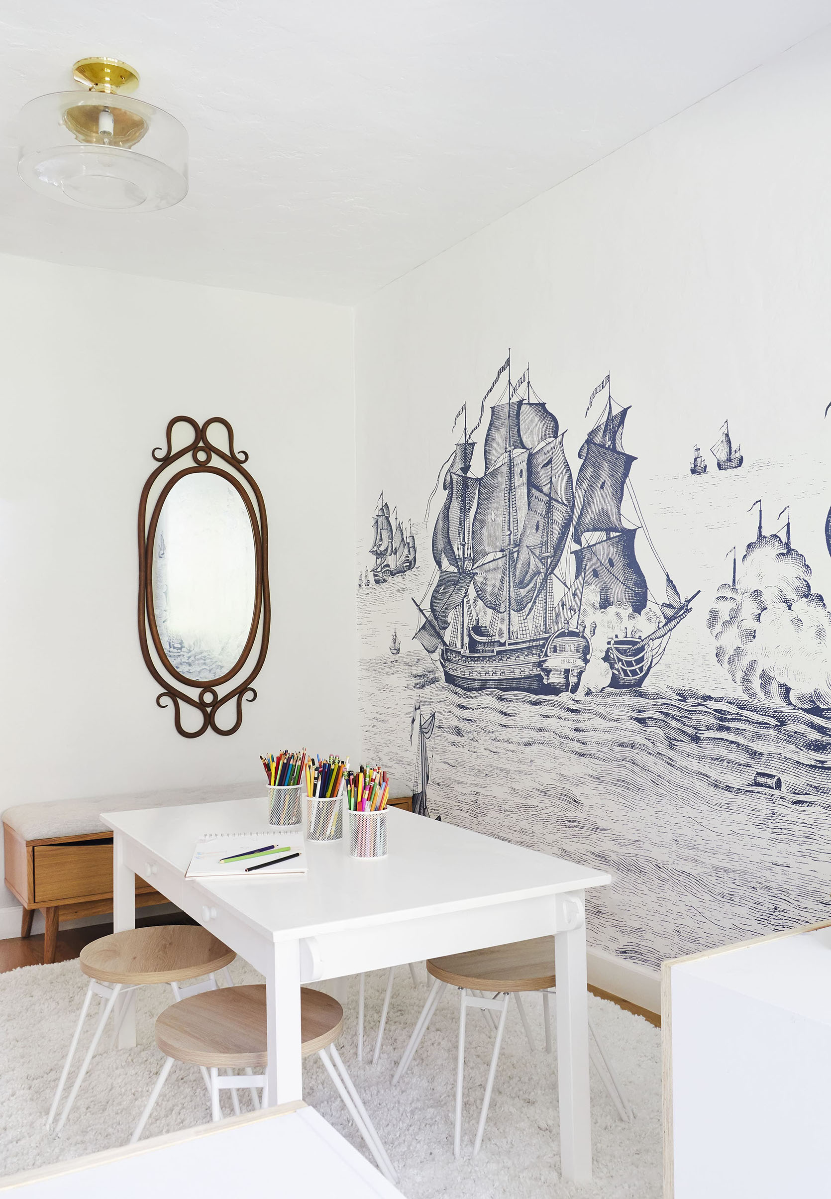
But then I remembered that I’m a literal interior designer and should try to make a space look “good”. So the answer was a custom ship mural, obviously. We needed something to “anchor” the space (going on the road with that one) and pull you in there, without being super loud or a big busy pattern. I LOVE IT.

I also switched out the ceiling fixture, the sconces to match the rest of the house and rearranged the room to create an almost pre-school like separation of the space. Now, while this isn’t visually the most amazing space it worked at the time. The architecture of the space really lent itself to that separation, they each got a side with four cubbies and they would sit in there for hours and play legos. I think kids feel really safe when they have a contained space and it really allowed them to focus on one thing/activity at a time.

The other side of the room was a bench full of art supplies, that vintage mirror (that is now in the kitchen) a play table big enough for me to sit with them, and a big round rug (no longer available) that really opened up the space (and held up strangely well until the pups really claimed it on our one and only trip to LA with them).
NOW TO STAGE THIS ROOM TO SELL
This room was a very controversial space to style to sell. We had to ask the same things we ask ourselves every single day. What is its purpose? Who are we trying to sell to? How should it be styled to appeal to most of the people without having to totally redo it and spend a bunch of money???
So, at first, I styled it like a playroom but more paired back, letting in more light and making it feel bigger and brighter.

I gave away the cubbies with the rubber band peg wall on the back to an Insider Member (via our Garage Sale topic) and just had one bookshelf that I had been hoarding forever from Target (so cute – going to Portland with us). I liked how it looked but I also feared that I had lost all objectivity of this room.
So I enlisted opinions: A friend came over and said, “This looks dismal” which I thought was a bit harsh, but I appreciated the honesty. My stylist friend Scott said, “Wow, you are really appealing to like, just moms with small kids.” And finally my realtor Howard said, “Listen, we’ve got the ‘mom’ demographic already what with the two very styled out kids bedrooms and the PLAY CASTLE and swings – so let’s make this more of a grown-up room”.
LESSON #4: WHEN STYLING TO SELL DON’T MAKE EVERY ROOM A PLAYROOM
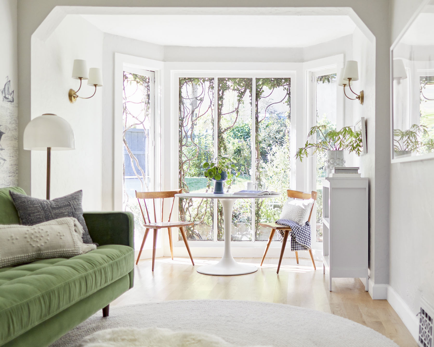
While I felt that this home would be bought by a family I also had to face the fact that it might NOT and by styling it too “kid” we were reducing our chances of a DINK buyer (double income no kid – my favorite acronym I learned this year). Fine. I’d redo it to make it more of a room that could be either a family room, den, older kids’ homework area, office, breakfast nook, or yes – a TV ROOM.

Sofa | Wall Mural | Cream Lumbar Pillow
There you go. And I think for staging purposes it’s pretty cute. I didn’t have an extra small scale sofa on hand, but I reached out to Article and they lent me one for the month (THANK YOU). I will say that the proportions of this sofa are very comfortable (seat depth, height, arm height – comfortable and ergonomic) and it comes in many different configurations and colors. It is a good one and very popular for a reason. Sara has it in Pacific Blue in her TV room:)
I bought that IKEA round pedestal table (but wish it were antique pedestal instead) and pulled everything else from storage. Again, it helps to be a hoarder.
The rug was originally in Birdie’s room but we just left a sheepskin up there and brought this one down here. I’ve had that antique store drawer piece forever, but the lamp – OH THAT LAMP – is amazing because it is all fabric so it’s lit from the base through the shade. It’s from Human Home and we bought it for my friend’s makeover (coming soon!), then I stole it for myself once I saw it.

Table | Cabinet | Planter
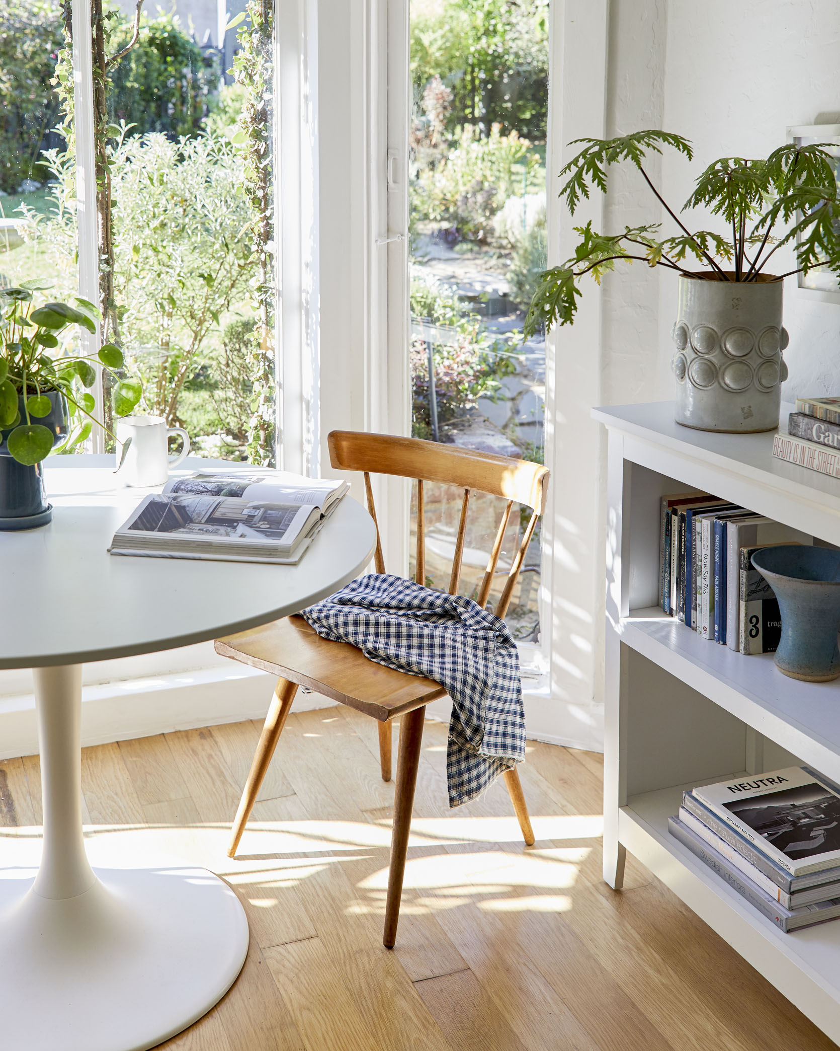
I added some vintage Paul McCobb chairs that I’ll hoard forever, and we swapped the cute house bookshelf that was here with the simpler one that was in Elliot’s room.
I feel like no photos can do this room justice. When I was sitting there writing the blog I was like “this is a special little spot,” but for whatever reason it doesn’t pop on camera. I think that it needs more visual weight at that end of the room – like a wood table or a wood or maybe colorful bookshelf. But I used what I had on hand besides the table and it totally works and I knew that adding a “heavier’” table could also make it look smaller so I erred on the side of “simple, light and open.”


The other side of the room opens to the kitchen and I finally found a place to hang that amazing painting by Colin Scott Glasgow that was homeless until that day.

Flushmount | Cacti Art | Round Rug | Sheepskin | Pouf | Graphic Painting
The goal was for us to show people that you can have this little den/tv room if they wanted one, not just a playroom. But either way, it’s open to the kitchen and dining room which is indeed a big plus.

There you go. Our playroom turned family room, with a few lessons learned along the way. With more time and money I could have dialed this in more to make it more portfolio worthy, but at a certain point I had to let my perfectionism go to make way for “sleep” and “feeling sane.” ?
In case you missed any of the other reveals so far check them out: The Living Room | The Kid’s Shared Bedroom | The Basement Guestroom/Office | Basement Bathroom | Elliot’s Room | Kitchen and Dining Room | The Entry | The Front Yard
**Final Reveal Photos by Sara Ligorria-Tramp


Leave a comment