How To Choose An Exterior Paint Color + Our Favorite Shades AND Combos
We may be an interior design blog… but today, we’re changing lanes and chatting exteriors. That’s right folks: this morning, it’s all about the CURB APPEAL. The weather is cooling down and many of us are heading into a long weekend, so what better time than today to lay out a plan for a nice lil’ exterior paint update?
But before we jump straight into the color recommendations, I wanted to share a quick process for planning that will save you BIG BUCKS as you decide on which samples are worth picking up and testing. Y’all, I learned a whole bunch about exterior paint — like, did you know that a color on brick will dry lighter than the same color on stucco or siding? I could write a whole lot more about why this happens (I definitely fell into a google-hole as I researched), but instead, I’ll offer the point: I have a couple of things to keep in mind that will help you hone in on the right color and will save you from buying a million tiny cans.
So in the interest in speeding up your decision-making process and keeping some dollars in your pocket… we begin with a quick guide. LEARNING IS FUN, RIGHT? (If you don’t need the primer, just scroll down a little bit. I won’t be *too* offended.)
Step 1: Study Your Home

I know that you know what your house looks like…but take a step back, and really give the ol’ girl a GOOD LOOK. Some questions to ask:
- Is my roof warm-toned or cool-toned? If you have something black or neutral, the world’s your oyster! If you have a terra cotta roof, you may want to lean into warmer colors. If you’re rocking green- or blue-tinged shingles, consider sticking on the cooler end of the color palette. Also, take a second to peek at the fascia: is it visible? Do you want to paint that, too?
- Do I have any existing stone or brick? If you’re not planning on painting your masonry, you can’t go wrong by choosing a primary house color that corresponds with the undertones in the stone.
- What about tiles or pathways? If you’ve spent money installing concrete tile or a walkway to your front door, what color is it? This whole Q&A section really comes down to figuring out if you should be sourcing from warm-toned or cool-toned colors. (P.S. Paint is kind of like lipstick — there are still things like cool reds out there! You’re not cut off from a color just because it’s traditionally warm or cool — this will just help narrow down which part of the spectrum you should be picking from.)
- What I am actually painting? This is when it gets complex. How much are you changing? Shutters? Trim? Columns? Window mullions? The front door? It’s easy to make 2-3 colors across the house look professional. An example: If you want to keep your white mullions (or if they’re ingrained in your window), consider testing out a white house with black shutters and a green front door. Or vice versa! The options are endless — and if you really want to run with a whole bunch of colors, you can! — but it’s easiest to pick 2-3 colors and to run with them.
Step 2: Decide On Your Color Inspiration
THE FUN PART. You’re already here! This is easy, and I’m sure you already have a general idea in mind. Maybe you want to test out the dark exterior paint trend…or maybe you’ve always dreamed of a cute red cottage place…or maybe your Pinterest board is filled with bright white and blue homes in Santorini. Whatever your inspiration, take what you’ve learned about your house and finalize your dream plan (…in the abstract. We’ll get to picking actual colors next).
Step 3: Consider the Light
AH, LIGHT. The true trickster! Here’s the thing: painting outside is NOT EVEN A LITTLE BIT CLOSE to painting inside. I thought it was similar and I. was. wrong.
Let’s talk science: it’s outside. The light is way brighter and way more blue than you think. (Is this science? Am I doing it right?) So let’s say you’re scanning swatches online and you think you’ve stumbled upon the perfect light greige or a great bright white — I am here with the sad truth that those colors are going to pull way lighter (and blue-r!) outside.
A key tip: instead of buying every shade on a color swatch, try just picking up your favorite choice and the color that’s 1-2 spaces down. We’re going to get into some of our favorite tried-and-true picks below because it’s seeing paint in action is invaluable…but if you happen to fall in love with a picture, just keep our good pal THE SUN in mind.
The sun and your environment — like your yard, your garden, a pool, or any hardscaping — will change the way that light reflects. Imagine this: a color on a house in the middle of the sparse and golden Joshua Tree desert will pull drastically warmer than that same color painted in the middle of a lush green Oregon forest, because the light will be bouncing around the space differently. So many factors!
And for those with masonry — like I mentioned earlier, stones suck up paint in a whole different way! Priming stone with something like this will be key as you attempt to maintain color steadfastness — the brick will be able to absorb the primer instead of the paint, which will keep you from having a *slightly* mismatched house.
Step 4: Try It Out
CRITICAL STEP, obviously. While you can do the old EHD trick of painting samples onto watercolor paper and taping it up to your house, I’d recommend testing paint straight on the siding or stucco in question. You’re going to want to see how your exterior surface absorbs the color — these materials can be more finicky than their indoor counterparts — as well as how the samples stand up to any weather, like rain or dew.
You’re gonna want to keep an eye on those paint samples morning, noon, and night. (What’s more exciting than watching paint dry? Watching a whole bunch of dried paint that basically looks the same and trying to decide which is best!)
Step 5: Decide
If you’re having decision paralysis, it’s okay to phone a friend. Or, you can grab a trial to the Community and ask us! Or…if they all seem good and they’re just too similar…flip a coin. You were measured and thoughtful and smart in your planning and selection process — it’s going to look AMAZING. 🙂 Just make sure you grab the outdoor brand of whichever color you’ve chosen!
AND NOW THAT WE’RE DONE, WE’RE ON TO THE MAIN EVENT: Our favorite colors IN ACTION. Whether you’re just looking for some exterior paint ideas or hoping to copy a whole palette (I can’t blame ya!), you’re in the right place. There’s something for everyone here, but we’re starting it off with the very frequently-requested Mountain House paint color…
PS. I included links for all the colors in question but O.M.G. you will be FLOORED by some of the differences between swatch and daylight once we get into the lighter paint colors. Just saying. IT’S WILD.
Our Favorite Dark Exterior Paint Colors

The Color: Sherwin-Williams ‘Laurel Woods‘ (Siding), Sherwin-Williams ‘Iron Ore‘ (Trim), and Sherwin-Williams ‘Tricorn Black‘ (Front Door and Deck)
Why It Works: Ah yes, the official declaration of the paint colors! This is a prime example of picking colors that are perfect for the location — this deep green and black combo is modern and mountain-appropriate, but it’s also bold and stunning against an all-white backdrop in the winter. It’s dark and interesting without being ominous or spooky. GOOD JOB, BOSS.

The Color: Benjamin Moore ‘Black Tar‘
Why It Works: Do y’all know that saying that goes “if you’re not going all the way, why go at all?” Yeah? Because that’s how I feel about this place. I am very into a modern farmhouse with a uniform coat of paint — it’s sleek and minimalist and tidy while still feeling homey and appropriate for the setting.

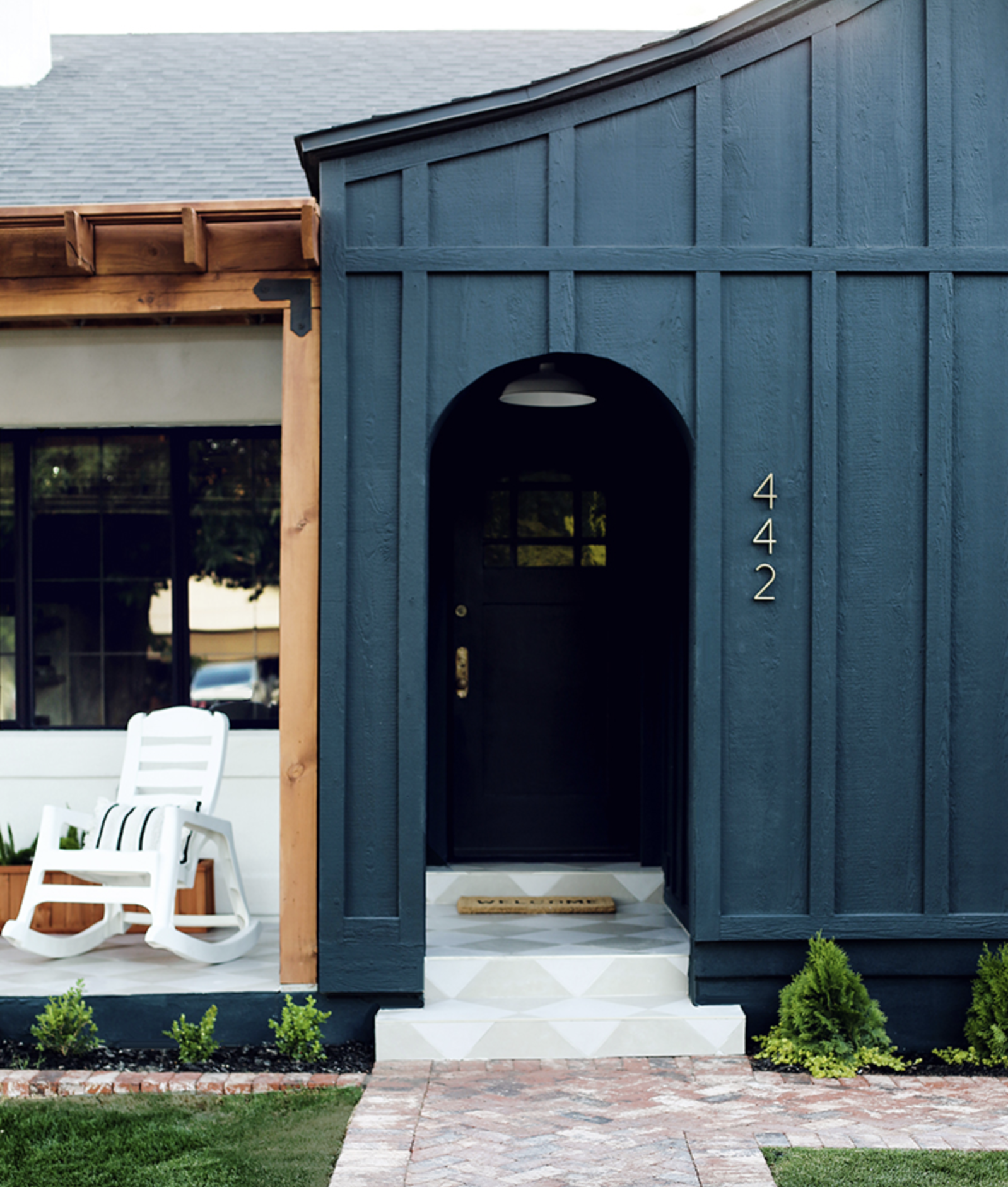
The Color: Valspar ‘Nocturnal Green‘
Why It Works: If you’re interested in highlighting your landscaping or your tile…going dark is a great choice. Nocturnal Green looks great with this cool roof, bright green fauna and checkerboard tiling AND it thrives when put in contrast with warmer elements, like the natural wood pergola. Juniper Home actually did an awesome writeup (with photos!) on choosing this paint color — it’s definitely worth a read.

The Color: Benjamin Moore ‘Hale Navy‘
Why It Works: A deep navy with a clean white trim is timeless and elegant. This place is actually a restaurant, Josephine House, and it’s SUCH good inspiration for those who’d like to go dark with their exterior but who also worry about accidentally leaning a little too gothic. Navy is a safe bet to bring some punch and character without sacrificing a more traditional feel!

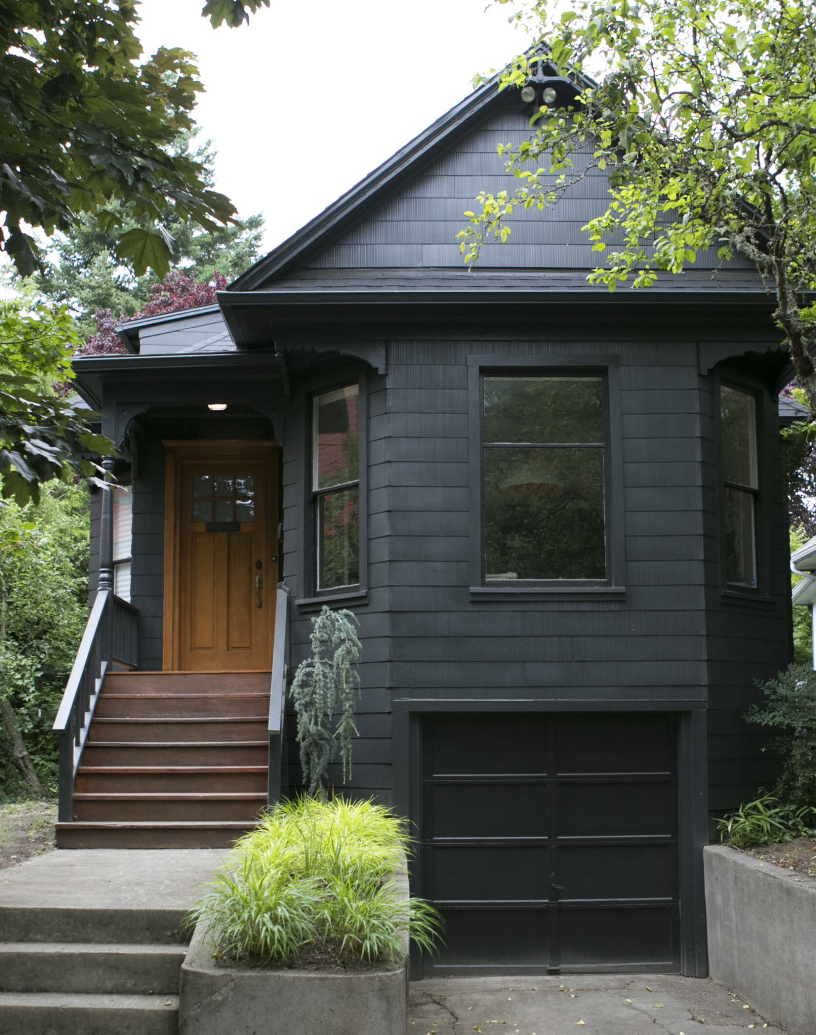
The Color: Benjamin Moore ‘Graphite‘ (Siding), Benjamin Moore ‘Black Onyx‘ (Trim)
Why It Works: I am obsessed with Victorian homes painted black. It’s modern and special and in a weird 2020 way, it almost highlights the architecture because it’s so bold. Here, the mixing of a dark gray on the siding and a true black on the trim still bring in some depth (and that wooden front door provides warmth!).
Our Favorite Light Exterior Paint Colors

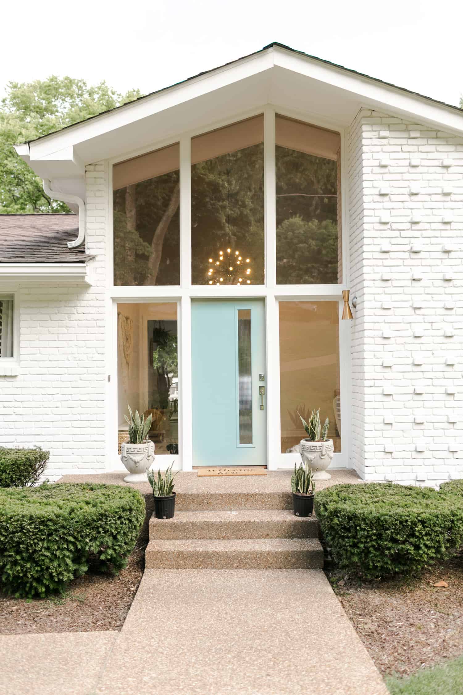
The Color: Behr ‘Swiss Coffee‘
Why It Works: What a mid-century treat for us!!! The before and after linked in that blog post is worth a peek — it’s incredible (and it includes some great intel on painting brick!). You may be familiar with Swiss Coffee as it’s the go-to paint choice for landlords with good taste everywhere — my last two apartments have been painted Swiss Coffee — but it reads as such a nice white here. AND HOW CUTE IS THE DOOR? And the light fixtures? And the windows? Painting the brick and trim in the same color unified the space, which lets your eye take in all those aforementioned goodies.

The Color: Benjamin Moore ‘Standish White‘ (Exterior), Benjamin Moore ‘Rockport Gray‘ (Trim), Benjamin Moore ‘Crimson‘ (Shutters and Door)
Why It Works: This one has a special place in my heart! I grew up with a similarly-colored front door and folks used to stop in front of our house, walk down our hilly driveway, knock, and then they’d ask my mom for the color. More than 20 years later, it seems WILD to think about — opening doors for strangers?! — but the palette here evokes the same friendly feeling. The soft beige paint (which reads very tan in that swatch!) and taupe trim are SO. GOOD. at bridging the roof and masonry…and obviously, that pink is a delightful pop of color.

The Color: Sherwin Williams ‘Greek Villa‘ (Exterior), Sherwin Williams ‘Caviar‘ (Trim)
Why It Works: An American take on a Greek classic color palette! Inside, it’s a creamy off-white (and one that Sara actually used in her own home!), but outside, it’s a crisp and bright white that doesn’t come off too stark.

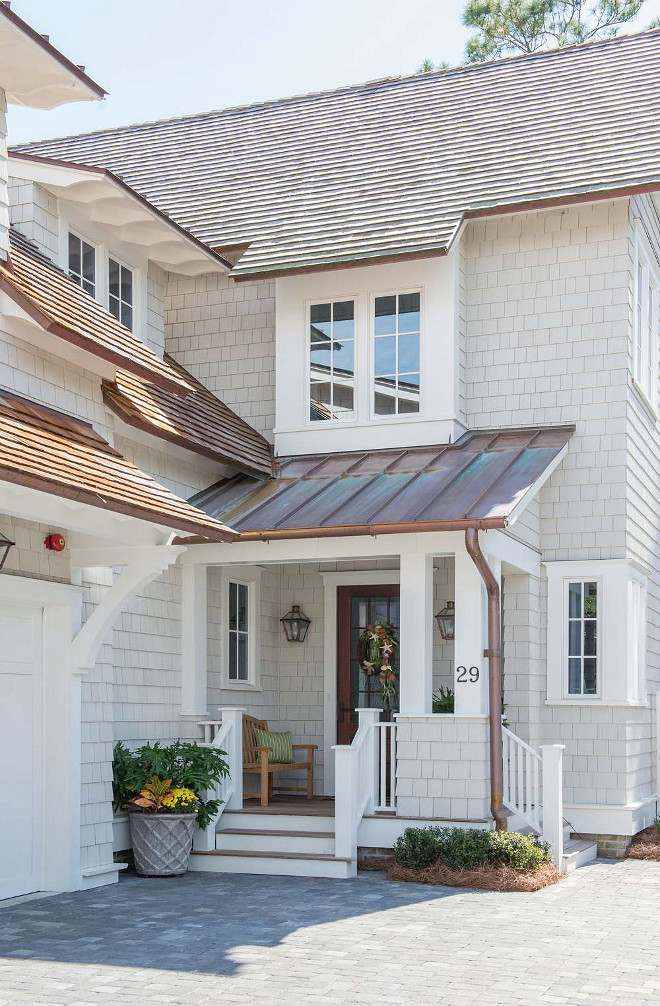
The Color: Sherwin Williams ‘Repose Gray‘
Why It Works: If you’re looking for something with a little more visual interest and depth than a stark white, Repose Gray is a perfect choice (and also one that looks so much darker in samples before it’s up on the exterior!). Here, it’s a warm choice that ties in the cool stone with the copper roof.

The Color: Sherwin Williams ‘Pure White‘ (Exterior), Sherwin Williams ‘Privilege Green‘ (Trim)
Why It Works: You notice how this ‘Pure White’ pulls a little green when it’s on the house…especially when compared to the fence next to it? It’s the light bouncing from the green surroundings and back on to the house! ‘Pure White’ is a little warm and soft to begin with, but it’s definitely amped up here. Also, the choice to go with green on the shutters, door AND trim is tasteful and simple.
Our Other Favorite Exterior Paint Colors

The Color: Dunn Edwards ‘Rose de Mai‘
Why It Works: If you haven’t seen the hype about Oeste Home on Instagram, I’ll give you a second to scroll through all those pictures real quick…but OKAY, WOW. This home is a masterclass for those looking to create a cohesive paint and tile situation! Oeste makes a real case for matching your paint color to your surroundings — the place is stunning at sunset when it blends into the mountains.

The Color: Sherwin-Williams ‘Sullivan’s Island‘ (Siding), Sherwin-Williams ‘Charleston White‘ (Trim), Sherwin-Williams ‘Beach Flower‘ (Door)
Why It Works: How welcoming is this? A pale blue-green mixed with a coral door is so sweet, especially in a city like Charleston. (Y’all have to click through and get a close up of her door knocker. It’s truly too much for my heart.) It’s just clean and eye-catching and a little bit preppy… LOVE IT.

The Color: Sherwin-Williams ‘Connor’s Lakefront‘
Why It Works: WHAT A BEAUT. This property is cohesive: one peacock paint color that echoes the shingles, one bright red front door to tie in the brick chimney, and a crisp white trim and fence to package it all up. It’s a modern take on the classic red, white, and blue color scheme without being too “I painted a flag directly on my house.”

The Color: Benjamin Moore ‘Georgian Green‘ (Exterior), Benjamin Moore White Opulence (Trim), Benjamin Moore ‘Wethersfield Moss‘ (Shutters)
Why It Works: It’s the perfect example of a warm-toned green! This sage/olive combo perfectly complements the corrugated roof and wooden front door. Let this be a lesson that you’re not limited to just neutrals when your home’s unchangeable features skew on the warmer side — you can still have a color you love just by altering the tone a bit! (P.S. This nature makes both greens look *so much more* green!!!)

The Color: Valspar ‘Sharkfin‘ (Siding), Valspar ‘Wave Crest‘ (Trim), Valspar ‘Quarry Pond‘ (Shutters)
Why It Works: Ah, here’s a perfect option for all you who are interested in dipping a toe into the color pool! This home goes a little more tonal, with paint colors pulled straight from the roof. It’s bright, but it’s also still subdued and timeless.
AND THERE WE HAVE IT. 15 examples of good, beautiful, real-life exterior paint jobs at work. Do you love your exterior paint? Are you inspired to pick up a project this weekend? What say you??? Let’s chat 🙂


Leave a comment