DESIGN MISTAKE: Different Walls, Same Art Configurations (AKA It’s Time To Bring Life To Your Walls)
A new design mistake coming at you, but it’s complicated so to really understand it we created a formula. Here’s what happens: you have this one piece of art and you put it on a wall, and you have this other piece and you put that on another wall. You continue until you deem the room ‘done’ and then you look around and wonder why the room doesn’t just sing.
I GOT YOU. There is a formula, a science in which we use to consider decorating pieces on ALL FOUR walls of a room. To speak in scientific terms, your eye wants to move around at a pace that is both exciting and relaxing. It has to do with variety, keeping it interesting and a bit unpredictable, yet giving it some negative space and simplicity to calm it down a bit.
After staring at years of my/EHD work I realized that we have a very intentional (yet organic) way of doing this. Here are the options (pick one for each wall):
- One large piece
- Gallery wall
- Grid
- Medium piece
- Diptych
- Mirror
- Stacked pieces
- Something sculptural
- 3 Dimensional, (like a clock)
Hot Tip
Vary the orientation and the medium/type of art of two pieces next to each other.
That’s right – every wall in a room is addressed with a different configuration of art/mirror or sculpture. Two of any of those things next to each other looks competitive and yet redundant. Imagine two gallery walls next to each other? Two large paintings? Two mirrors? Two grids or diptychs? It seems like of course, you wouldn’t do that, and yet I see it over and over mostly because all of us just use what we have and simply hang it on the walls in an attempt to not have it blank. I GET IT. We can help.
But since real-life examples and explanations are almost always better… Shall I demonstrate? Behold:
Let’s take the Portland living room for example (let’s call it Exhibit A). We have a grid on the fireplace wall, a single horizontal piece, a single vertical piece, and a peek into the open dining room that has a diptych.
Then on the other walls, we have a ‘leaning gallery’, a blank wall because then we have a large vertical leaning in the nook. No mirror or anything ‘sculpture’ but that’s because we have the sconces that help add that 3-dimension. See how your eye is never bored and continuously hopping around?

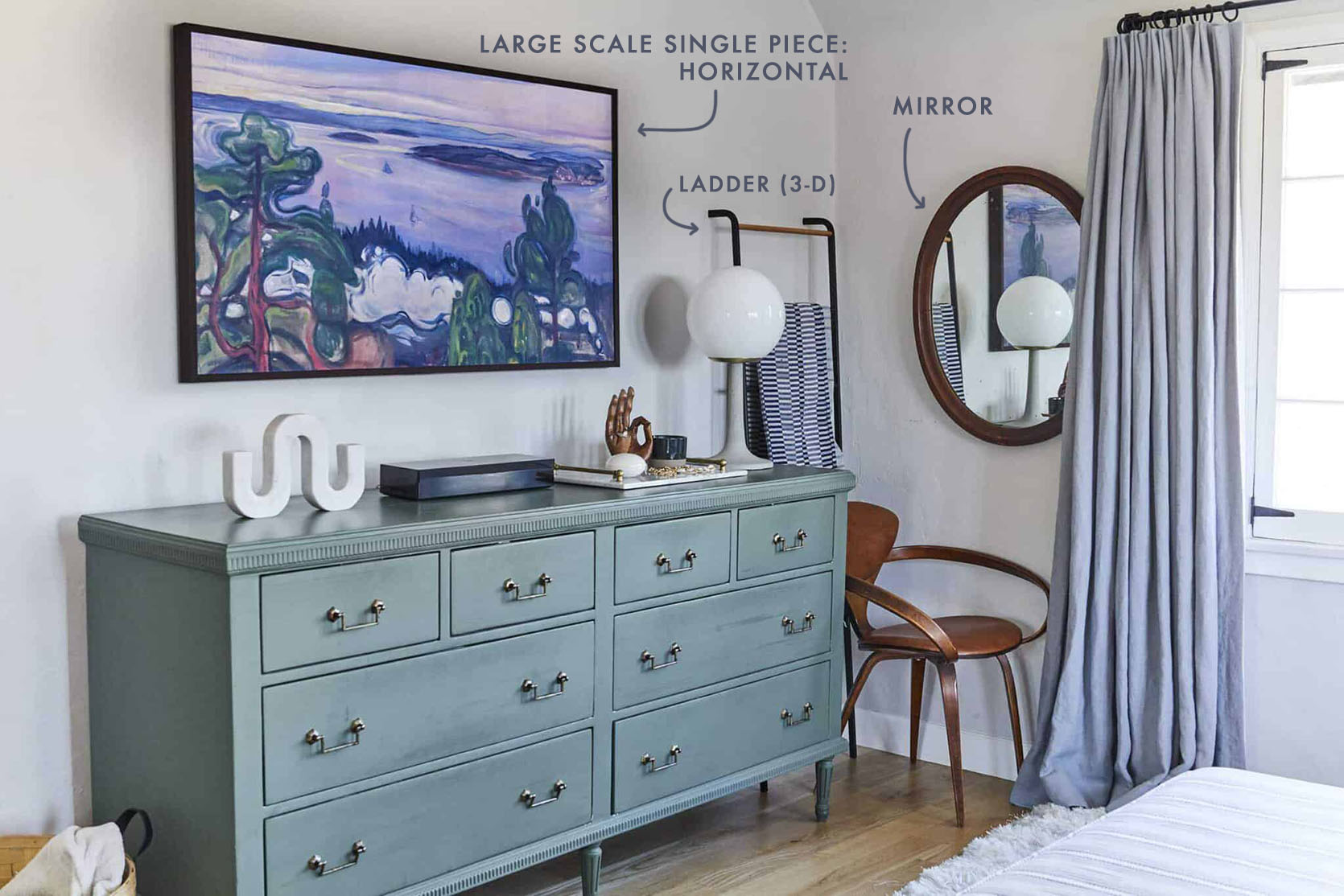
Exhibit B – Our bedroom in LA. We have for you one big ‘piece’ (the frame TV), a mirror and I added a ladder which also acts like a ‘sculpture’ or 3-dimensional piece.
On the other walls, we have one vertical, two stacked pieces that don’t match (a mini-gallery), and a triple stacked grid (pretty sure that is a sandwich Brian would like to eat), with a big vertical mirror by the closet (not shown). And YES you can have opposing mirrors in one room, just not next to each other.
Exhibit C – In the kid’s room we have a gallery wall, a big statement canopy with two smaller pieces that match (a diptych of sorts), a mirror, a kite (3 dimensional), and a sconce (another 3-dimensional piece but more graphic than the kite). Each wall has its own thing going on, but all working together.
Exhibit D – Our old bedroom. A diptych above the bed, a single vertical, oval mirror, 3-dimensional sconces, and a mixed stack (mini-gallery).

This is an example of multiple mirrors in one room that still works. They are close but not on the same wall:)

Exhibit E – The Portland Family Basement playroom. Here we have a large focal piece next to a large gallery wall, a clock (round to shake it up), and even the swing is the ‘art’ for that corner, adding dimension.


Exhibit F – Emily Bowser’s living room. Here we have a triptych (flanked by 3-dimensional sconces), a large round mirror (to break up the squares). And on the other side of the room…

Here you have a vertical mirror, a single horizontal piece, and in the background a sculptural art piece. All different shapes that make this room sing.
Exhibit G – Jess’ studio apartment living room. An incredible floor to ceiling gallery wall, with a single vertical piece next to a vertical stick sculpture, with a large mirror and those peg hooks act like another 3-dimensional sculpture.
Exhibit H – Julie’s Bedroom. Julie really nailed it with her array of awesome wall art. First, there’s that great gallery wall full of 3-D objects right next to the neutral stacked diptych (nice balance). Then she DIYed that single vertical piece between her windows followed by her ‘raised off the wall’ horizontal triptych. To finish off the space, that long pill mirror. basically something interesting and different at every turn.
I could go on but it feels right to end on ‘H’:)
BUT if you are a little overwhelmed here is a great EHD go-to:

Does this answer your burning questions on how to decorate your walls in a unique yet cohesive way? I hope so. I know it can feel really intimidating when you are staring at empty walls. But as long as you vary the configurations, scale, and orientation (while working within a decided color palette, of course) you are likely going to get exactly the room you’ve been wanting. xx
Opening Image Credit: Photo by Sara Ligorria-Tramp | From: Reveal: A Budget and Rental-Friendly Living and Dining Room (With 80% Thrifted Finds)


Leave a comment