Sara & Mac’s Office/Guest Room Reveal – LOTS Of Function + Even More Color and Style
I’m back finally, and this time with the reveal of this long-awaited room – THE OFFICE . . . slash guest room. Plus, I’ve brought a special guest with me. The office user himself, my fiancé Macauley Johnson, who’s going to share a few of his thoughts on the room. I’m only mildly terrified of what he will say.
It is with great excitement that we present one of the first rooms where I feel that Mac and I actually found a middle ground in our design aesthetics (at least more successfully than before).
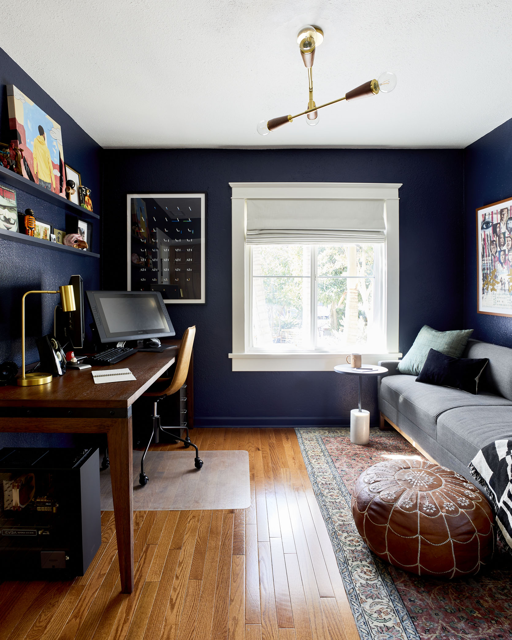
Navy Paint | Desk | Desk Lamp | Office Chair | Rug | Leather Ottoman | Sofa | Accent Table | Window Treatments | Painting by Koshin Finley | A24 Poster | Vintage Japanese Movie Posters | Custom Framing | Floating Art Shelves | Charcoal Candle
Quick editors note: Since Mac is going to be joining Sara for this post, his words will be bolded while Sara’s will remain unbolded.
OK, so. Where do we begin?
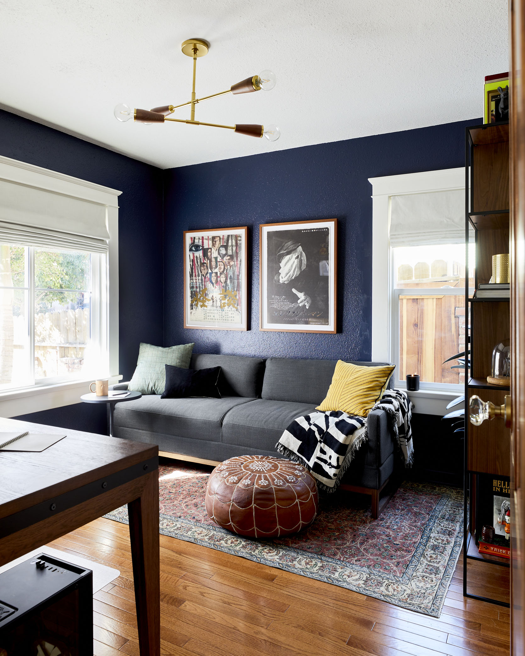
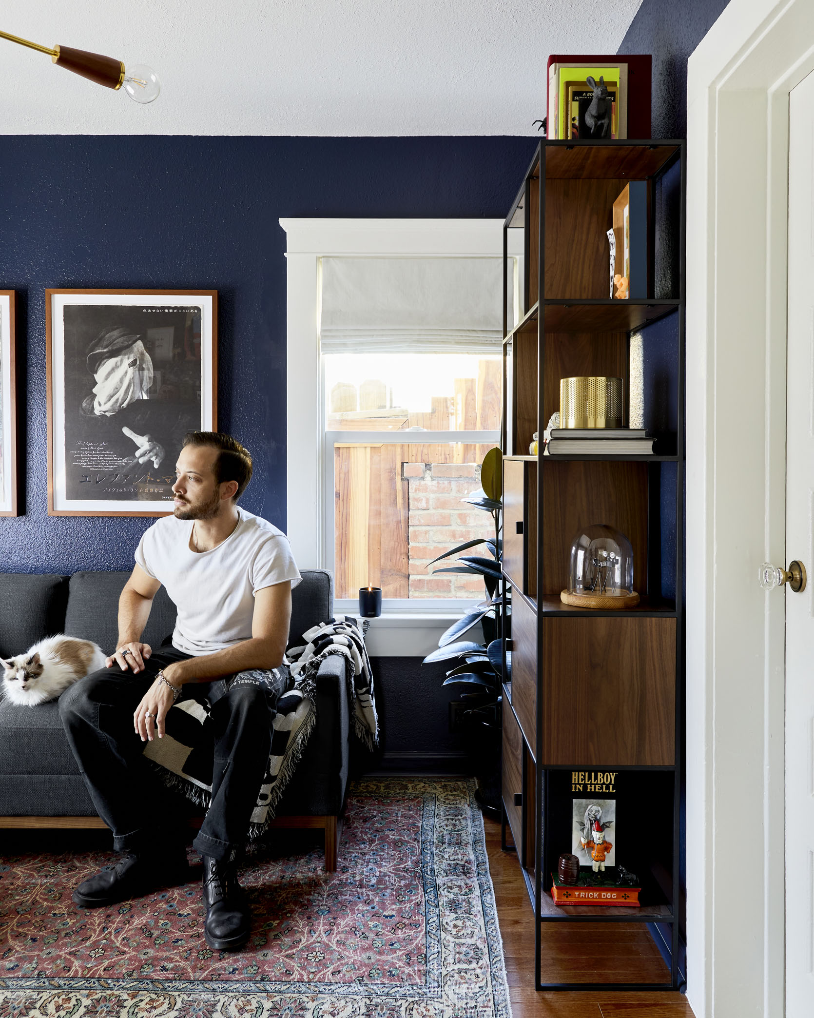
Probably the beautiful, inky blue paint that’s all over the walls. It’s “Goodnight Moon” by Clare Paint, and it was the perfect choice for this space.
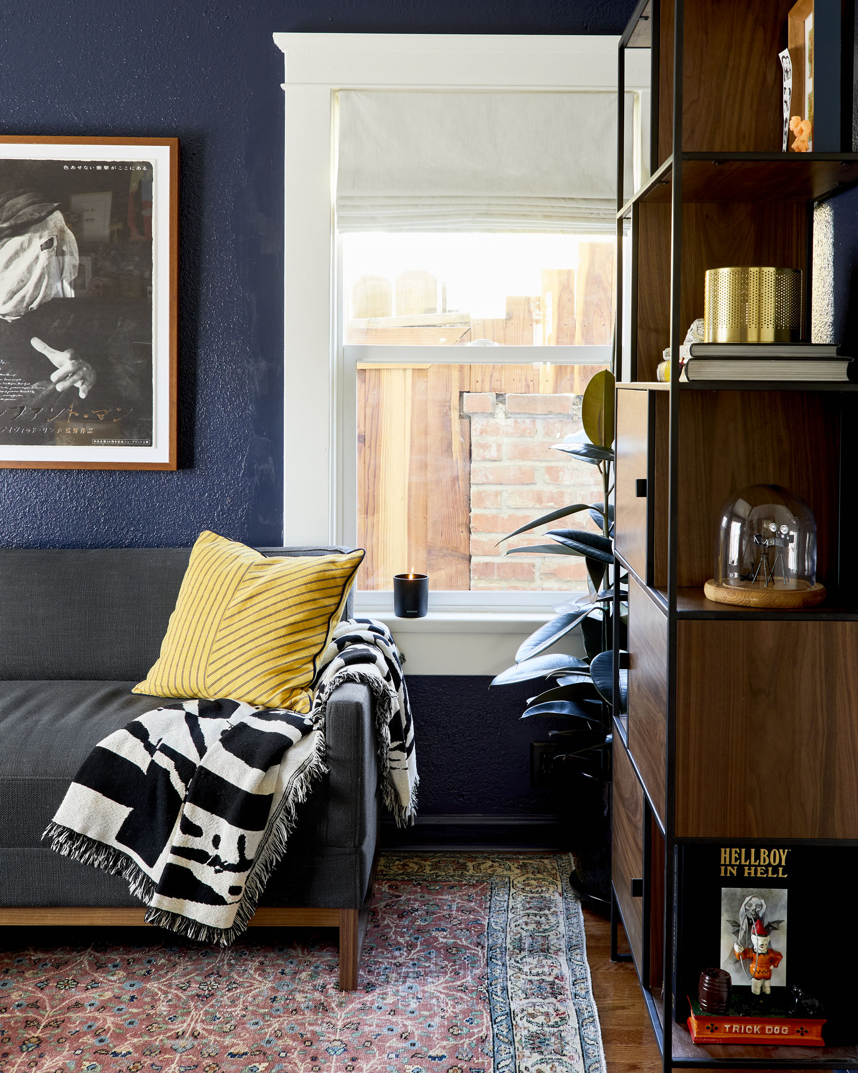
Mustard Accent Pillow | BLM Poster Art | Bookcase | Gold Table Lamp
I like it because it immediately gives the room a “mood” while still feeling playful because of its saturated color. Clare Paint has a really curated selection of colors, and because of that you aren’t trying to choose between 4 different navy’s. They’ve got one navy, and it’s the PERFECT navy. But Mac, I know that you don’t traditionally like blue, so how did I convince you to go navy in the office?
After going dark in the TV room, I wasn’t so afraid of going dark. The biggest leap was going blue at all (call me crazy, but it’s a color I steer away from). We had been looking at some black or charcoal wall colors throughout the house, so this rich, dark navy started to scratch that itch. In the evenings it gets dark, but doesn’t feel overwhelming during the day. We also decided to keep the ceiling and door frames white to call back to the rest of the house and keep it from getting too intense. This room feels a little more classic, while the TV room goes more stylized.
Yea, the layout of the room is a little strange since there are three doors all crammed into one side of the space. Figuring out the painting of the trim in that area was a little tricky.
Crystal Knob | Brass Knob
We ended up going with stained wood doors for the main entry and closet, and painting the bathroom door white. And we fitted all the doors with beautiful antique style hardware from House Of Antique Hardware.
Having crystal knobs for all the main interior doors felt like a nice through-line, but the closet stood out because it didn’t seem to want the same treatment. I mentioned going with something all brass, but you found the knob that fit the bill. It has just the right amount of vintage detail while still taking a backseat to the glass knobs. I like the idea of finding little artistic details like this one in lesser-seen corners of the home.
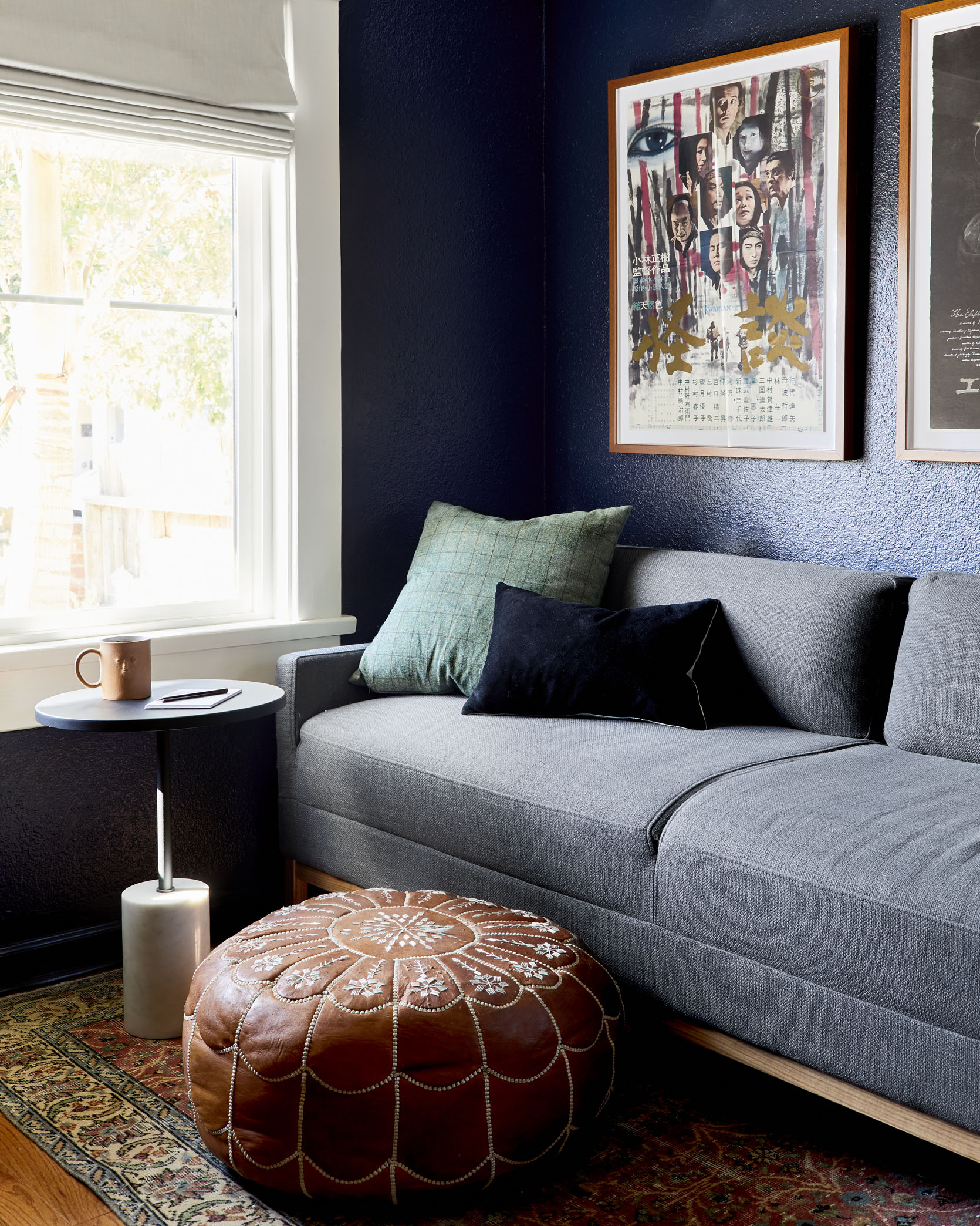
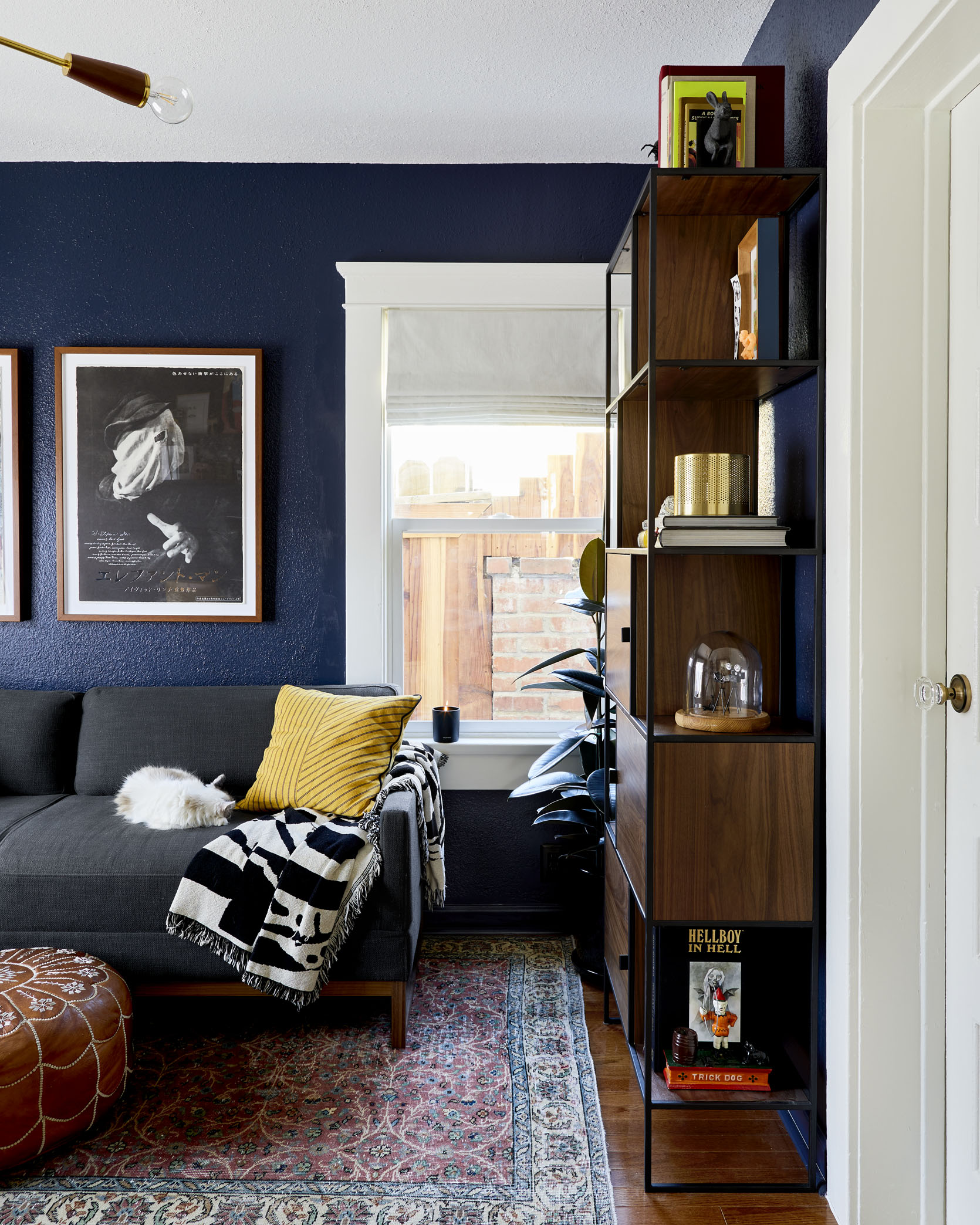
The next big piece in this room is the sofa. And not only is it a sofa, it’s a convertible guest sleeping sofa.
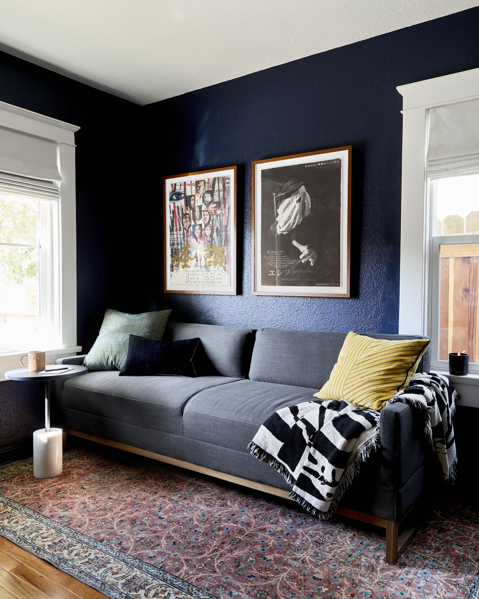
Sofa | Accent Table | Vintage Japanese Posters | Custom Framing | Rug | Mustard Accent Pillow | Candle
We really wanted to have a space where guests could sleep privately, but our home isn’t big enough to dedicate an entire room to that guest, right? A sofa bed in the office seemed like the easy, no-brainer solution. Our is from BluDot, and it’s beautifully simple in its design – the backrest cushions pop off, and the top cushions fold out, away from the couch to create a flat sleeping platform. We’ve had guests sleep on it as is, and said it was great. But we’ve also now started rolling out this amazing inflatable camping mattress that I found at REI that just happens to fit the platform perfectly, and makes it just as comfortable as any bed I’ve slept on. Plus the mattress allows us to fit the bed with a sheet.
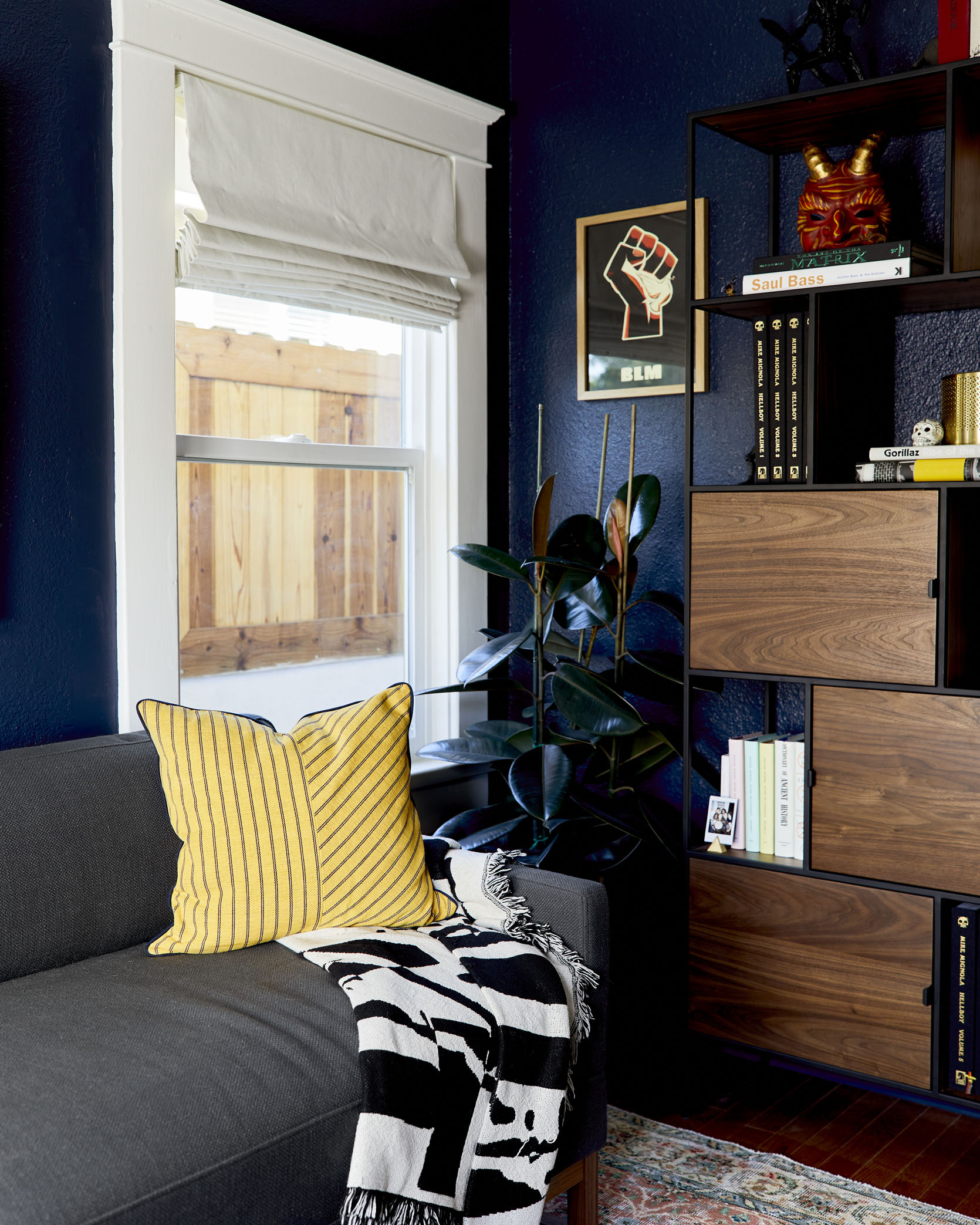
And the blackout linen roman shades from Decorview make this room perfect for any guests who like to sleep in a little. They’re the same ones that we have in the living room and dining room, which is a nice tie in between the spaces.
Ceiling Fixture
As you can see, the room isn’t HUGE, so we packed a lot of personality into each square foot. I wanted some brass in the room, and Mac wanted really good, bright overhead light for when he works in the evening. I think the ceiling fixture from Rejuvenation was the solution.
That, and I like how it classes the place up a bit, bringing in some metallic shine while still tying into the wood that I picked throughout. My style is usually not very refined (I have a lot of STUFF and that leads to clutter) so it’s nice to have key elements that both satisfy a functional need and add some style to the place.
I think we both agree that a good vintage rug brings a room together. We needed a very specific size for this strange, small room – one that stuck out far enough from under the couch, but not too far that it would run into the bookshelf or get caught under Mac’s office chair. Revival Rugs ended up having the exact rug we needed. Size-wise it fit perfectly, and the deep saturated colors it brings to the room play so beautifully off the deep wood and navy tones.
You have the eye for color and balance. And I’m usually in when the word “vintage” is involved. Turns out this was another great pick.
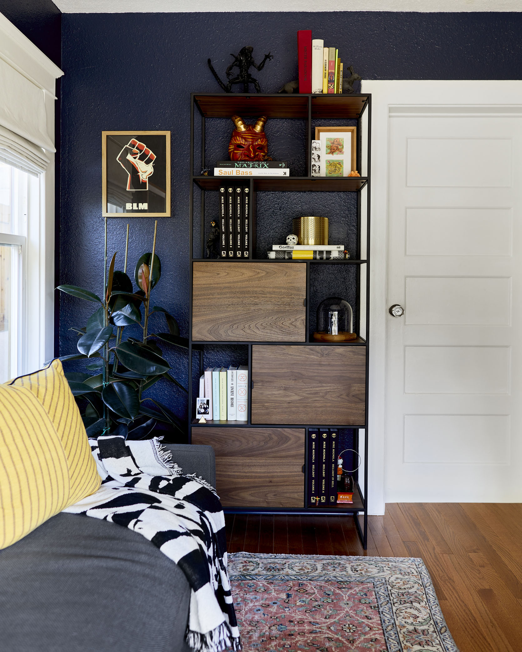
BLM Poster Art | Bookcase | Gold Table Lamp
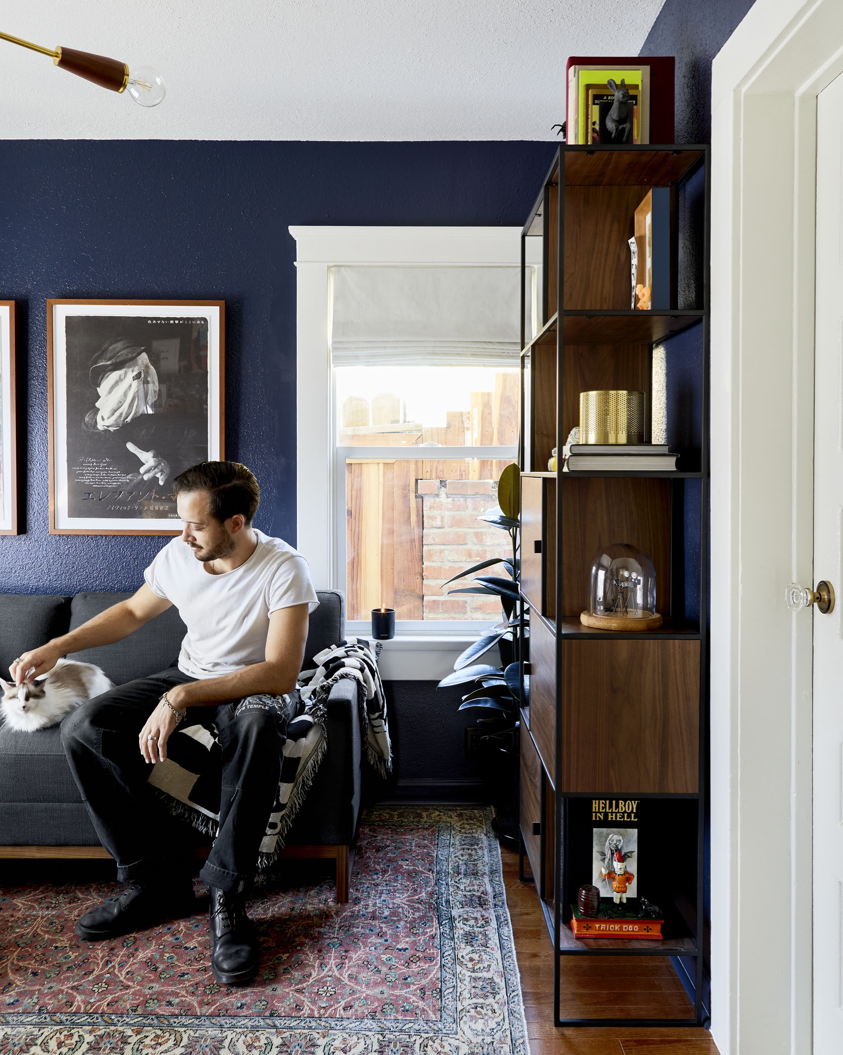
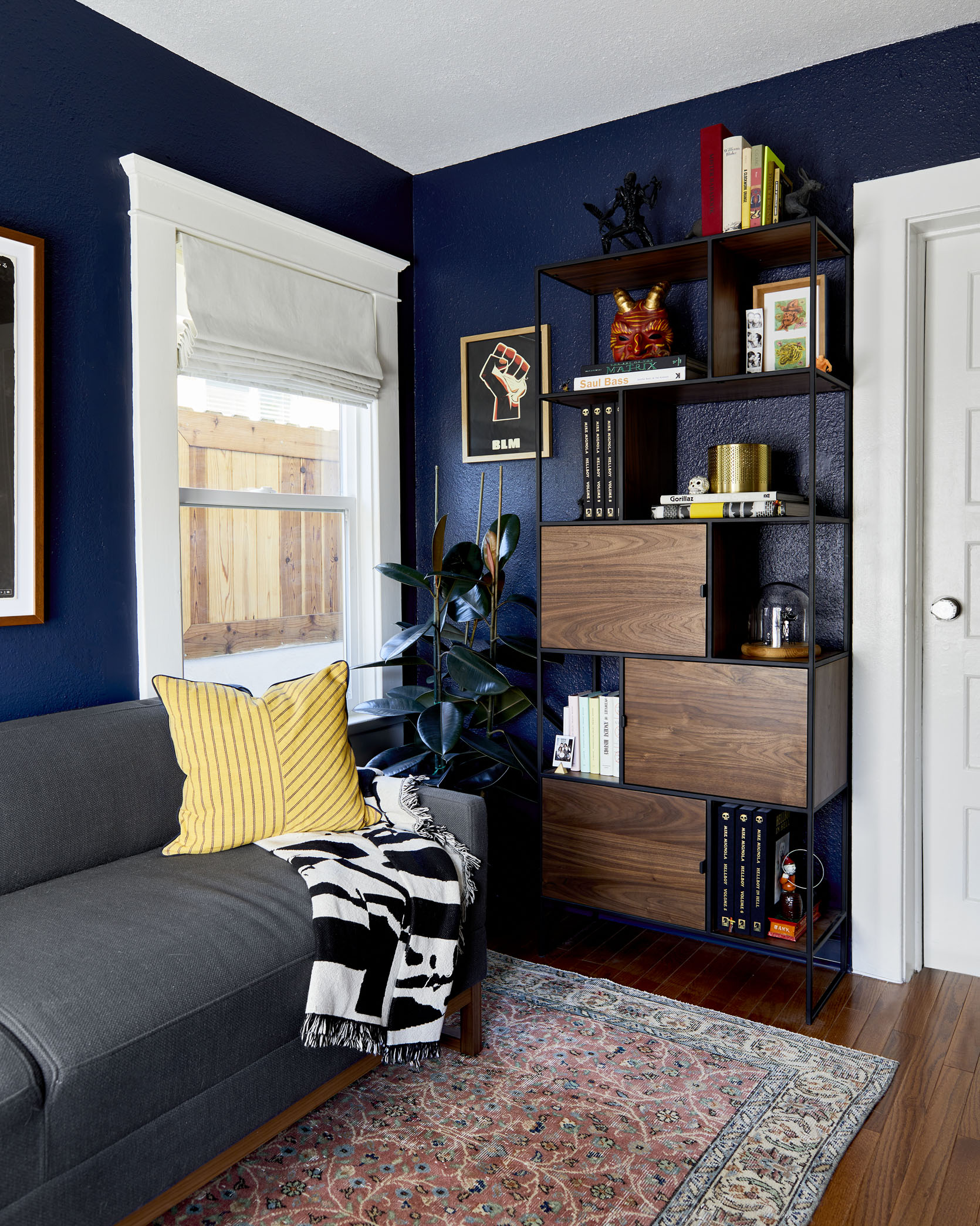
Alright, up next is the bookshelf from Article, which was really a 100% Mac driven decision…
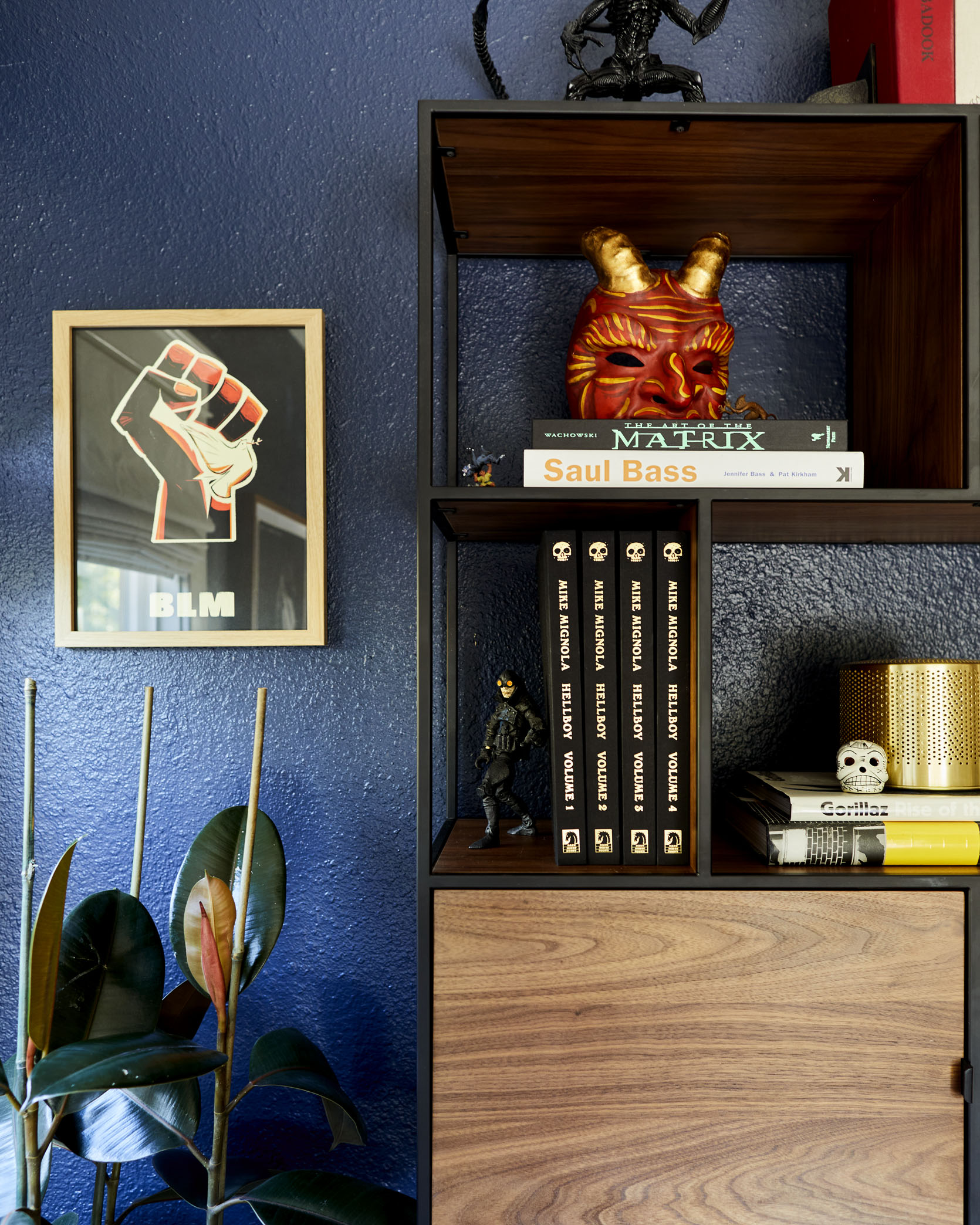
That means if it looks terrible, there’s only one person on the chopping block, but I am very pleased with it. First, it looks great – I have a thing going on in the room with right angles, metal, and deep wooded tones and this piece was all about that. The shelves felt like fun little areas to put pictures, figures, and other finds from along the way (STUFF). And it has a good amount of closed storage. That was especially something I was looking for: Hidden space to store the piles of things that don’t go so well on a shelf.
Mac, you also really wanted a plant for that corner, and to be honest I doubted you. I really thought we should center the bookshelf on the wall. I’ll concede though, you were right.
I did, hah. Part of that was me painting us into a corner (really, truly no pun intended) by focusing in on that shelf. The pros might say that it’s a bit big for the space, and it is. So when we had it closer to the window, you really felt the size of the piece against the stark, blue wall. I also wanted to bring some greenery into the room and I’ve never had a decent-sized plant, so we started a search. My only stipulation was that I couldn’t sit in the office looking at a fiddle-leaf fig after how many I see online regularly (Note: We have had one before and they look great, but I wanted something that felt different and more me). So we found this great little rubber tree at the Flower Mart downtown, and I hope to have it with us for a while.
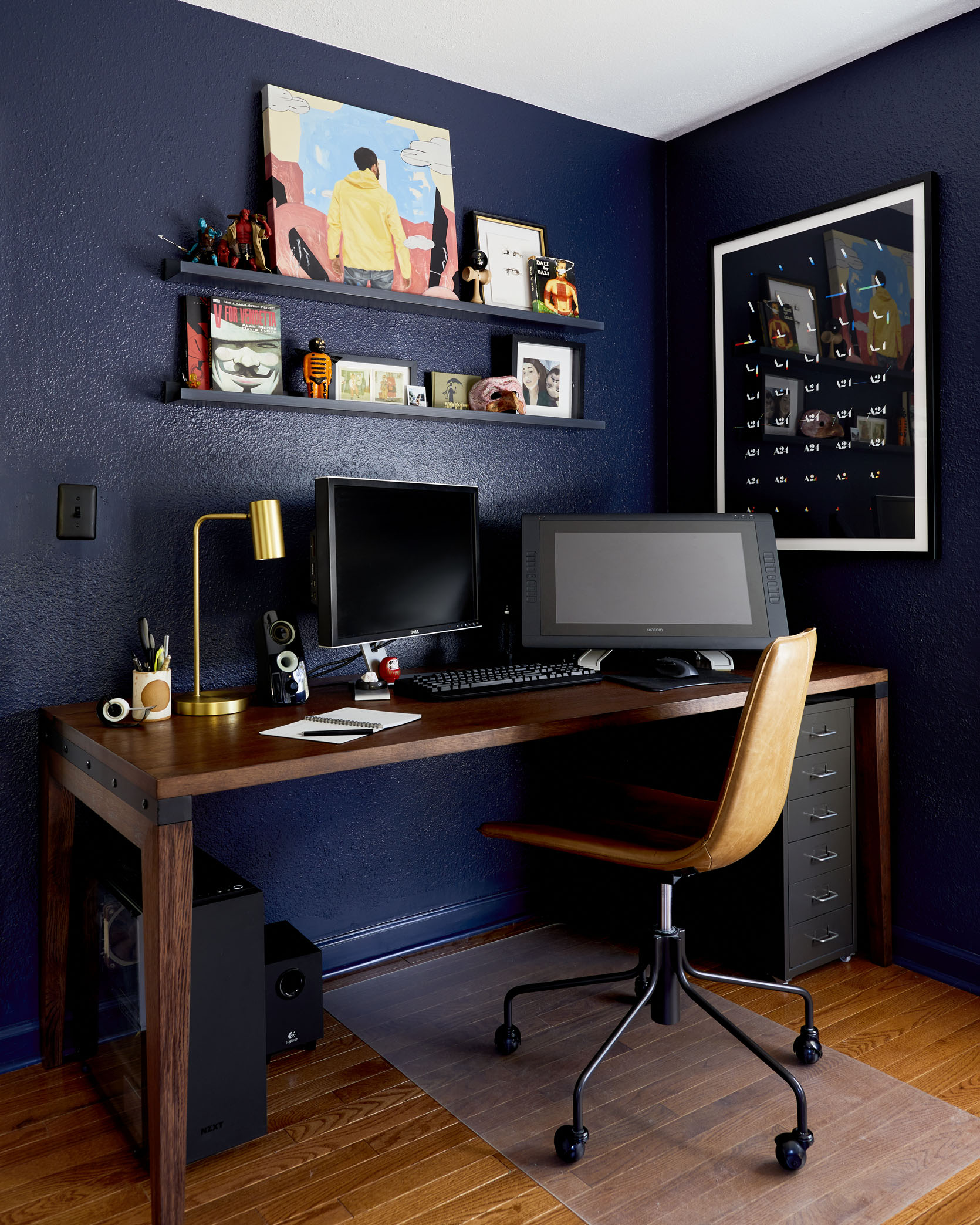
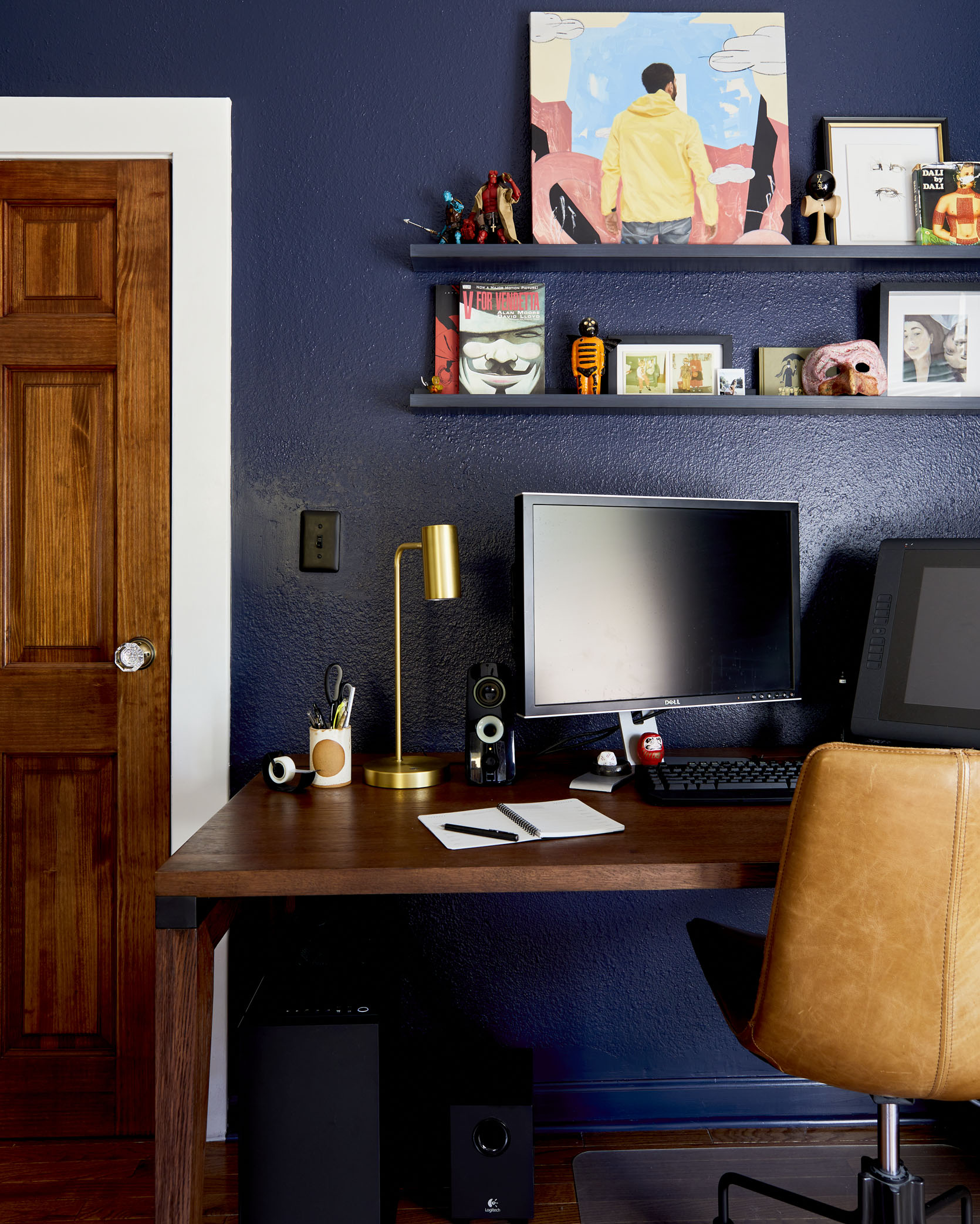
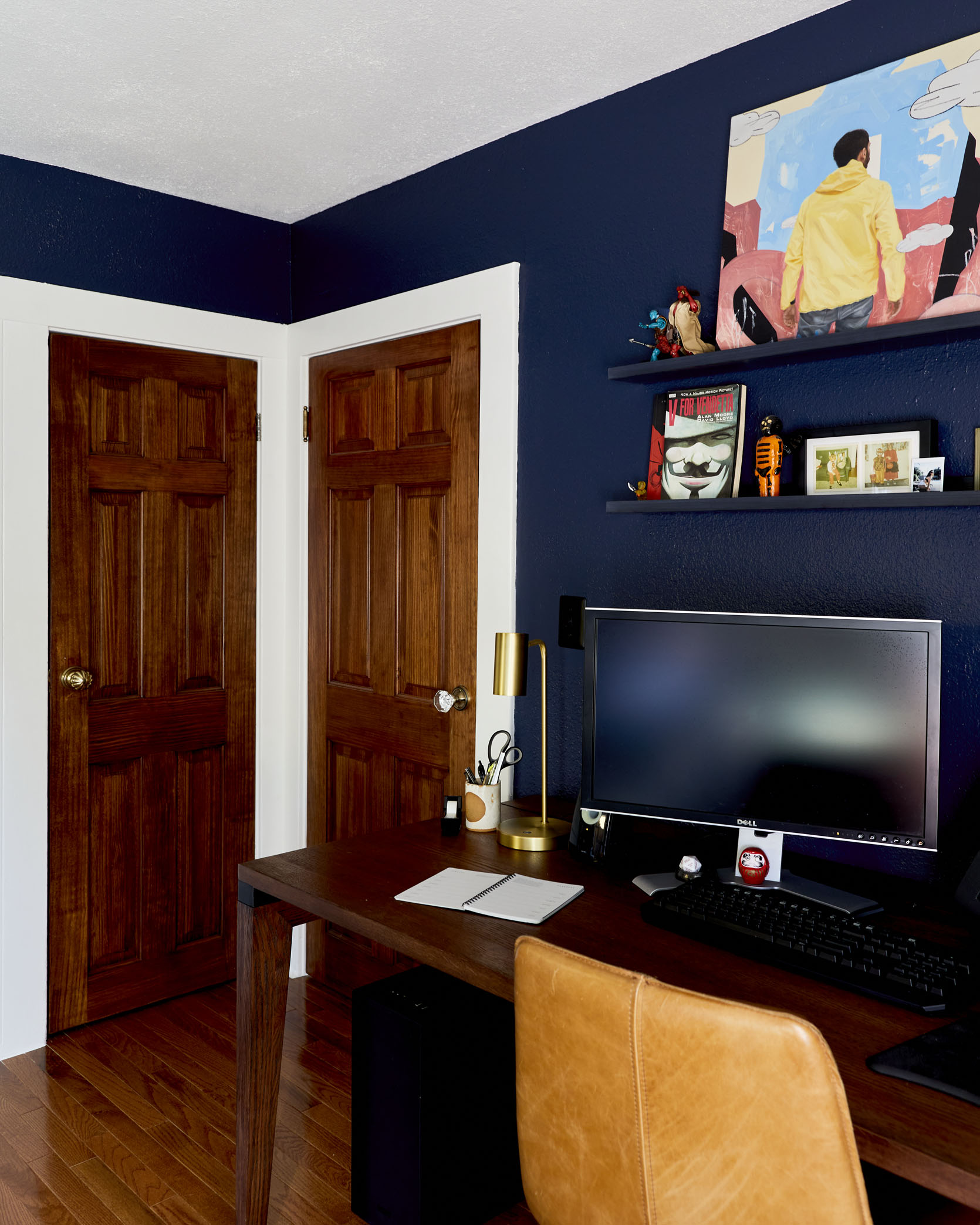
Desk | Floating Art Shelves | Art by Kohshin Finley | Custom Framing | Desk Lamp | Office Chair
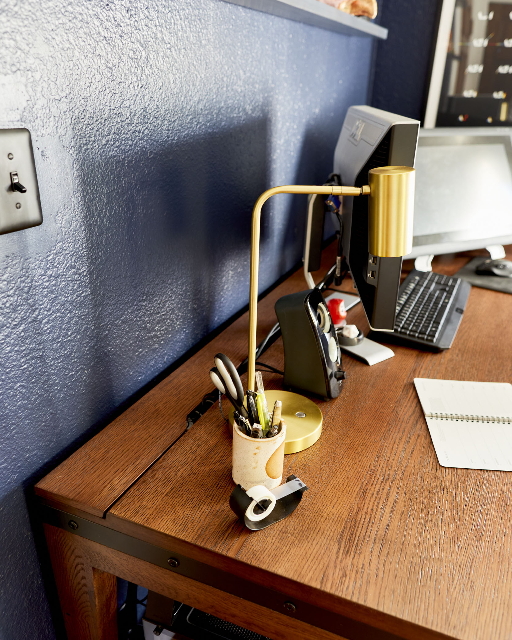
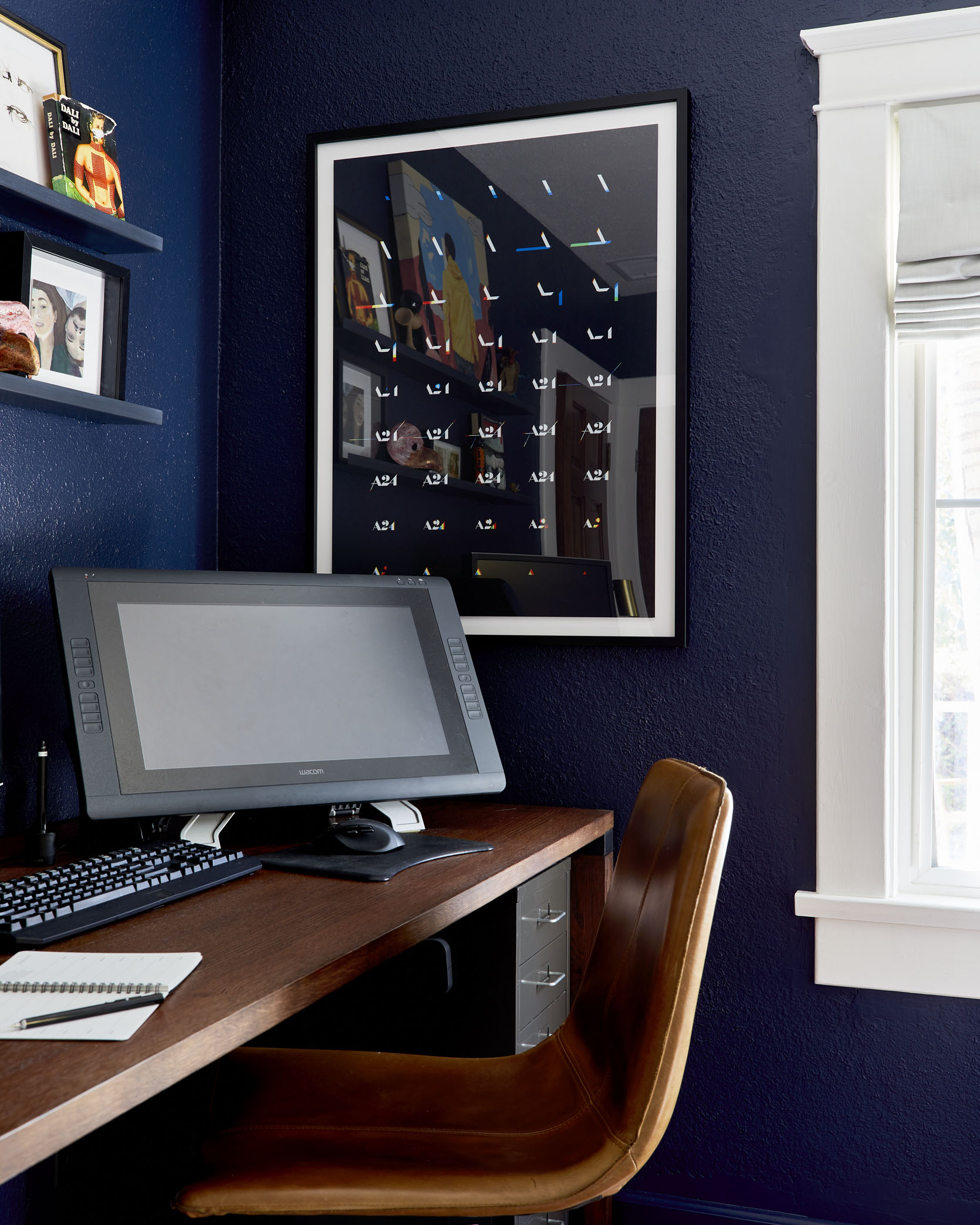
Here is where Mac works every day (he’s an Associate Creative Director at the motion graphics studio Scholar). I desperately wanted him to have a workspace that he actually enjoyed being in, and Mac really wanted a space that was functional for all his tech needs.
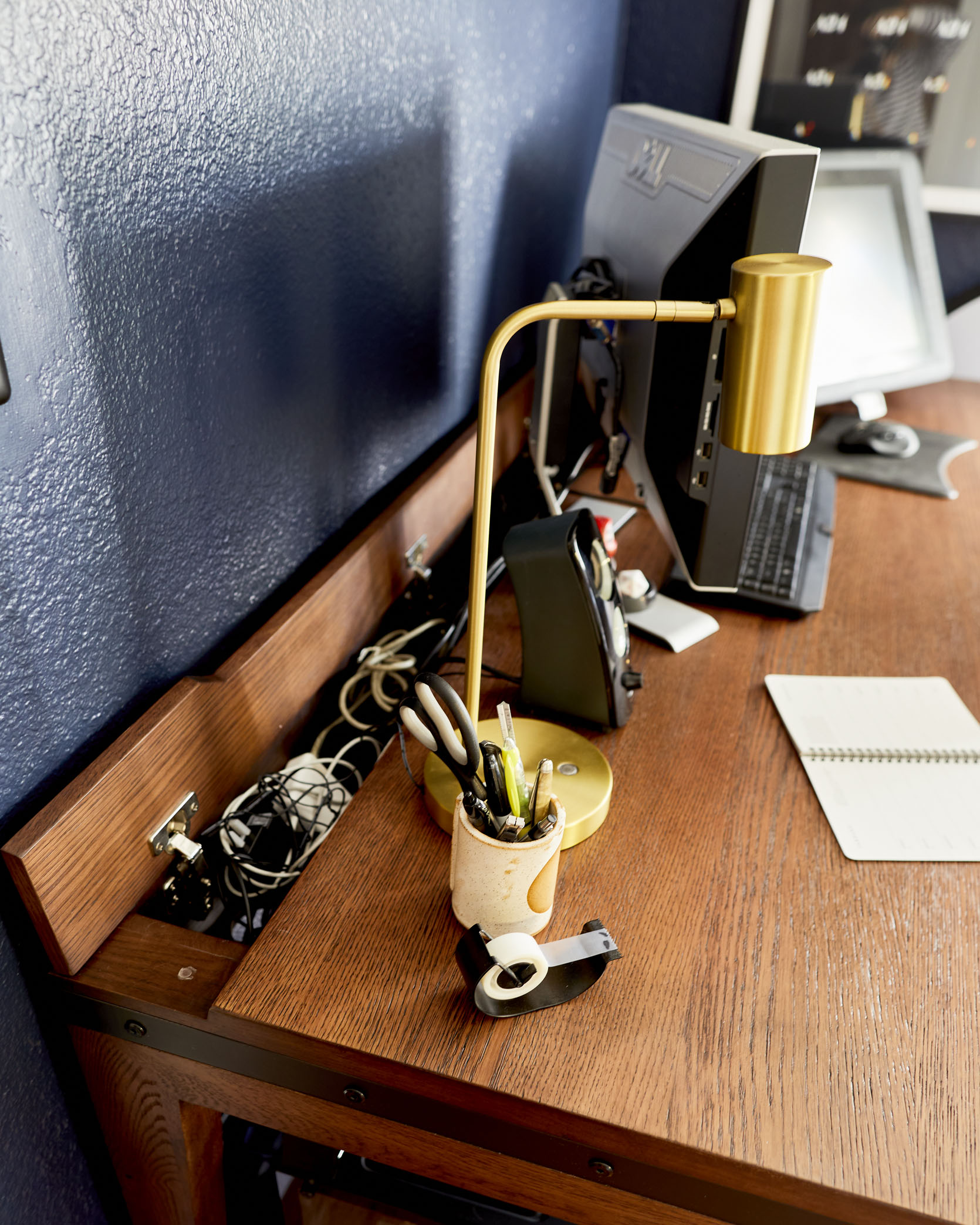
I like to have a lot of desk space because I usually work with a two-monitor setup. One of those monitors is a large tablet that can be drawn on and I end up moving it around a lot, so having some depth to the desk was also a must. Beyond that, I was looking for something mostly wood and sturdy because having heavy monitors on a wobbly desk is a big no and I’d like this piece to last a long time.
We found a few options that fit the criteria, but what won me over was this built-in cord tray in the Madera Oak desk from Article. The entire desk is extremely sturdy and it has the panel on the back that I can get in and out of to organize the ridiculous amount of cords I have. I had a power strip mounted under our previous desk, but now I have that power strip and all the cords neatly hidden away, which means no mess under the desk. We also opted for the wider option of the desk in case we ever both needed a desk at the same time. Which is great for leaning heads on each other’s shoulders, if you’re into that.
I really am 🙂
Most importantly, I really wanted Mac to impart his personality in this room. Your style is a bit more graphic and modern than mine, and can sometimes go more saturated or darker in color.
I definitely lean more graphic, finding bold shapes in movie posters or keeping clean lines in the furniture choices. I love typography so that graphic language carries through a lot of the things I’m drawn to. And then there are the figures. Whether small, skulled art pieces or actual action figures, I’ve amassed a minor collection and don’t want to hold onto things I’m only going to pack away. The floating art shelves made for great spaces to bring those in, instead of plopping Hellboy on the fireplace mantle (because not even I want that).
I think the fact that you picked all the art for this room was a hard aspect of the design control for me to let go off, and I know I still tried to influence some of your decisions. But I really love how it turned out. Why don’t you walk us through some of the art choices you made?
There’s a lot of movie stuff going on since films are a great passion of mine, so the opportunity to get more art on the walls meant I could nerd out a little. We ended up with two vintage Japanese posters, but that process of picking only two was arduous. Very happy with our picks though: One is more classic, really leaning into the ’60s style of the film, and the other is a more contemporary design with metallic silver lettering on the title. We got them both custom-framed through Framebridge, and they’re perfect there above the couch.
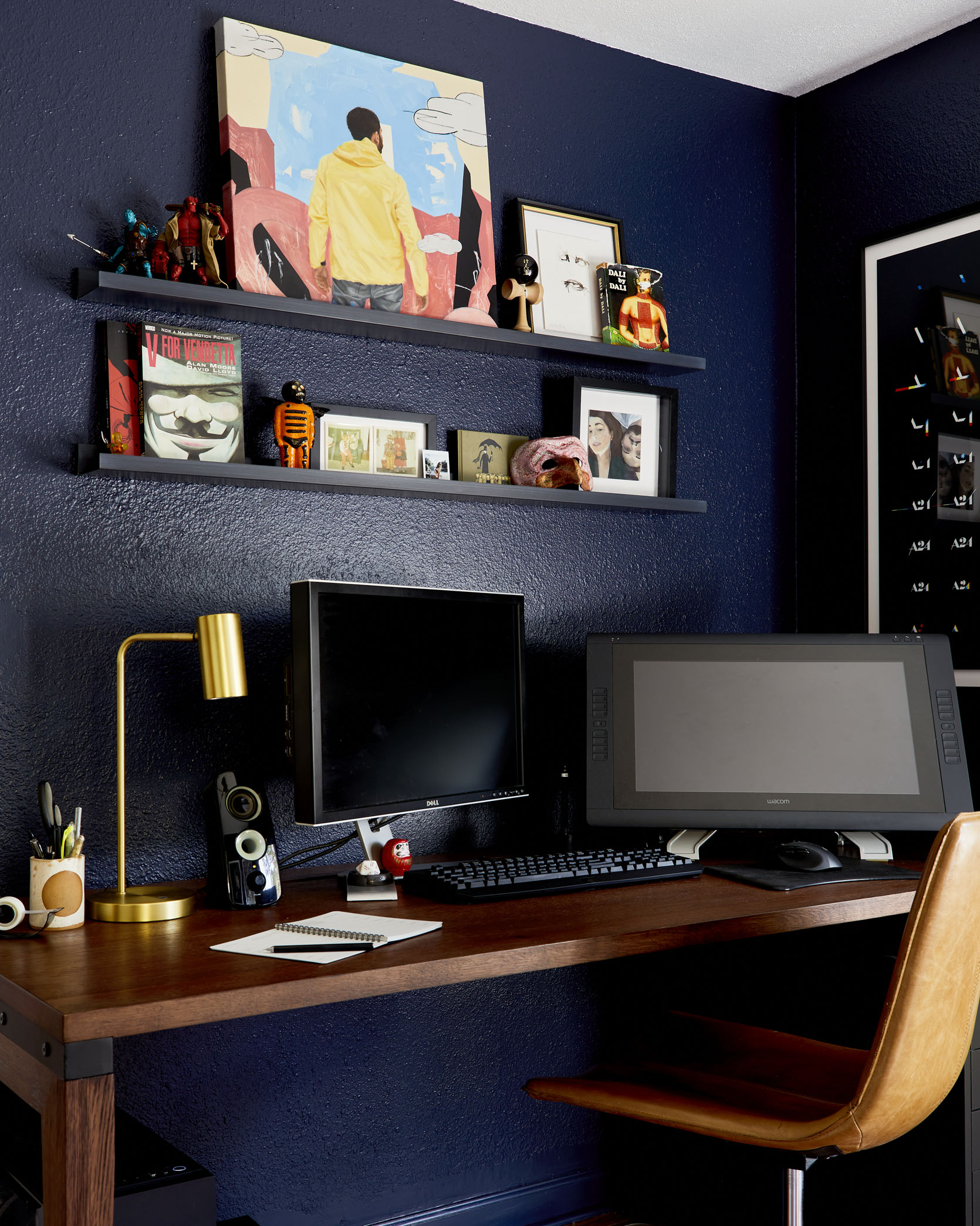
I wasn’t sold on the idea of art shelves at first, but it really didn’t make sense to add more large frames to an already crowded room. I’m happy that we could fit some larger pieces on there like the painting by friend and incredibly talented artist Kohshin Finley that some might recognize from the last time we had an office reveal on here. And there’s plenty of space to mix and matchbooks, toys, and art or whatever else I find along the way.
On the left is a piece from one of the amazing people involved with Artists4BlackLives, a collective of creators donating proceeds to Black Girl Film School. Next to it, the shelving made for fun little dioramas of art books and tchotchkes. These areas will be fun to change up just like the art shelves. And on the right, the A24 poster holds a special place in my heart combining my love for design and my love for movies – it’s the sequence of their opening title animation.
IT ALL LOOKS SO GOOD, and so you. Ok, I think we’re starting to wind down. Let’s go through some of our favorite aspects of the room really quick. I personally love this little brass lamp – when it’s turned on it gives a really warm glow in a pretty star-like pattern all over the walls. It was also your idea!
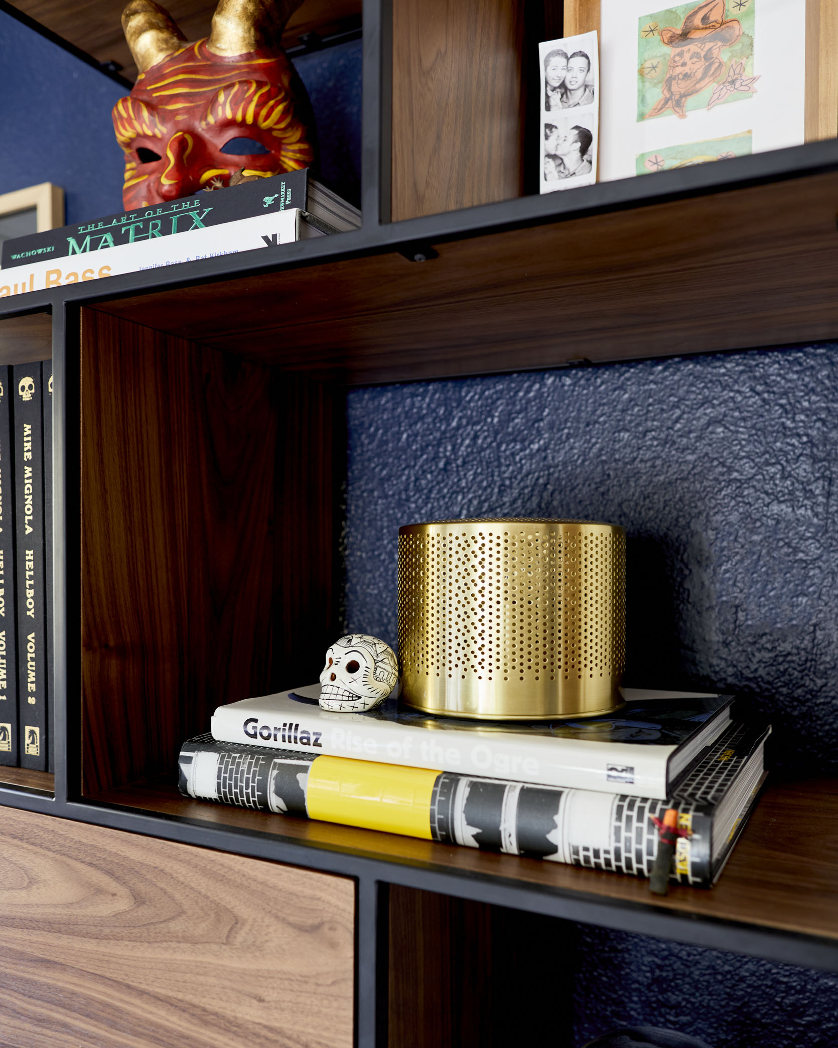
I enjoy the couch, desk, and framed art a lot, but the bookshelf has become my little kingdom. It has worked out exactly how I hoped and I still have space in those cabinets for, you guessed it, more stuff.
Overall, how do you think we did on this room? Like, how did you feel about the design process?
This room is really special to me. I love the whole house, but I enjoy how we’ve been able to bring different moods to each space. While I mostly work in the office, I enjoy taking a break from the computer, kicking back on the couch and taking the whole room in.
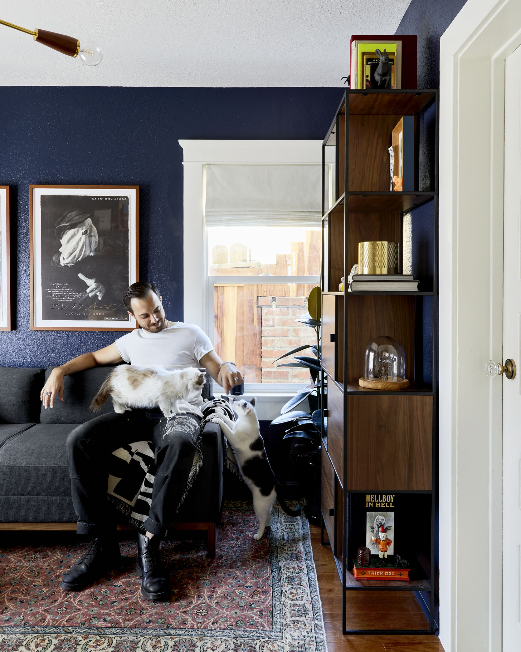
I also really like coming in there and napping on the couch with a cat or two while you actually work. And I’m so happy we were able to get this room done while you are still working from home, so you could fully utilize it. Once you go back into the office every day, I’ll probably take over your desk though.
Well, there you have it. Our finished office/guest room. It’s moody, functional, and most importantly it’s a space that we both love. Now, all we have left to finish is the kitchen, our primary bathroom, our bedroom . . . the front bathroom, the backyard, the front yard, the garage . . . does it ever end??
As always, a huge thank you to all the partners who worked with us on this space. And an even bigger thank you to Mac for joining me on this post. It was so fun to write with you, and pick your brain about the design process. And thank you for generally being a super patient design client and decor collaborator – as you can all imagine I’m not the easiest person to design with and I have a LOT of opinions and ideas. He might not be on board with all my ideas, but he hears them all out and has signed on for some of the crazier ones.
Stay tuned for our kitchen reveal, which is moving right along. We should have all the major pieces installed by January, and then it’ll just be about finishing touches.
**Design by Sara Ligorria-Tramp and Macauley Johnson
*Photo by Sara Ligorria-Tramp




Leave a comment